
Shiller's CAPE is a sensible measure of whether U.S. stocks are over- or under-valued. But for statistical analysis, it has some weaknesses. Correcting them can improve the insights that CAPE may offer about future returns from stock investments.

Background
Robert Shiller's CAPE is a well established, highly respected metric of the extent to which U.S. stocks are over- or under-valued, rooted in historical data that spans more than a century. Among its good points: CAPE is based on an idea which, on its face, makes a lot of sense. And it does a better job of predicting future stock prices than many other contenders (albeit, with some caveats). So, what's not to like?
First, consider the good points.
Essentially, CAPE compares a one-time snapshot to an historical trend. The snapshot is the price of stocks for large U.S. companies at a given time (the Standard and Poor's 500 or a reasonable surrogate). The trend is the average earnings of those companies for the preceding decade. Why use a 10-year average? Shiller's insight was that doing so smooths out the peaks and dips in earnings that companies experience during the normal boom and bust of economic cycles. Of course, over periods as long as a decade, inflation has to be considered, so CAPE adjusts all stock prices and earnings to express them in current dollars. In short, CAPE estimates whether, after making sensible adjustment for inflation, the current price of stocks is cheap or dear compared to companies' demonstrated ability to generate earnings. For a stock-buyer who wants to capture future earnings, it makes perfect sense.
What's more, CAPE is a decent predictor, according to standard statistical tests. In Asset Management, Andrew Ang evaluated 14 possible predictors of future stock returns, over periods from 90 days to five years. CAPE was one of only two that gave statistically reliable predictions, and, of those two, only CAPE can be calculated contemporaneously. If you want to make a decent prediction, without waiting for future data, CAPE is the metric of choice.
Now, the weak points:
- Balance. When calculated as a simple ratio and used in that form to conduct statistical analysis, CAPE is imbalanced. It gives too much weight to very high values (extreme over-valuation) and too little weight to very low ones (extreme under-valuation).
- Persistence. Counting current earnings for exactly ten years, equally weighted throughout that period, is not optimal. The persistent effects of extreme conditions are better captured by averaging earnings in a different manner.
- Trend. CAPE's message may be clouded by its own long-term trends. The CAPE value that is purportedly normal today may differ from what was normal decades ago.
Balance
To see how CAPE over-weights high values and under-weights low ones, consider the chart below. It shows historical values of CAPE, from January 1896 to December 2015, assigned to bins in what statisticians call a "histogram."
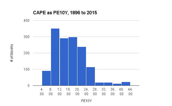
Here, CAPE is computed in the classical manner. Real earnings (inflation-adjusted) are computed every month for 10 years, then averaged, with every month's value getting the same weight. Today's price of stocks (the S&P 500) is then divided by the averaged real earnings. It's denoted as PE10Y, or the ratio of P = price to E = earnings over a period of 10Y = ten years. The chart shows, for example, that there have been approximately 300 months since 1896 when PE10Y was between 12 and 16, and another 300, between 16 and 20.
The shape of the histogram is distorted because the ratio can get very large, as it did during the dot-com bubble around the year 2000, when PE10Y exceeded 40. But it can only get so small. It can never get smaller than zero, by definition. Statisticians call this distortion "skew," and in this case the amount of skew is +1.04, because of the long tail to the right and the bunched values to the left.
When a skewed indicator is used to compute correlations or to do a regression analysis, the values in the long tail get over-weighted, and the bunched values at the other end get under-weighted. For example, when real earnings are double the normal value, PE10Y goes up about 16 points, from 16 to 32, and weighs heavily in the calculation. But when real earnings are halved, PE10Y goes down only 8 points, from 16 to 8, and is weighted as if it were less extreme. Yet, to return to normal, the halved earnings would have to double. The needs-to-double value of PE10Y = 8 represents a state of affairs that ought to be weighted similarly to the case of already-doubled earnings at PE10 = 32.
Academic researchers correct this problem by taking logarithms. It's easy, however, to find articles in public media that fail to do so. The next chart shows one way to make this correction. It displays the same data, after first dividing PE10Y by its long-term median (middle value), then taking the natural logarithm. The result is denoted LogrPE10Y where "Logr" (pronounced "logger") stands for this mouthful of jargon: "natural logarithm of the median residual."
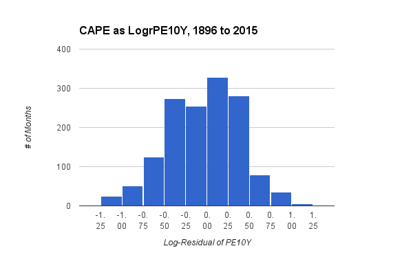
In this chart, the values are reasonably well balanced, although a slight elongation to the left has replaced PE10Y's extreme elongation to the right. Accordingly, the statistical skew for LogrPE10Y is -0.17, which is close to the ideal value of zero, though slightly negative. By using the median for the calculation, LogrPE10Y has exactly half its values below zero, and half above. Furthermore, a doubling of stock-prices would raise the metric from zero to about 0.7, while a halving would lower it by the same amount, to -0.7.
Notice that, in the chart for LogrPE10Y, halving of normal valuations has occurred a bit more often since 1896 than doubling of valuations. That's evident because the bars below -0.75 are somewhat higher than the ones above +0.75. From looking at the original, badly skewed chart for the ordinary PE10Y, you would never have seen that. In fact, you might have concluded just the opposite, because of PE10Y's long tail to the right. This observation is one way to appreciate the misleading nature CAPE's classical computation.
Notice that, in the chart for LogrPE10Y, halving of normal valuations has occurred a bit more often since 1896 than doubling of valuations. That's evident because the bars below -0.75 are somewhat higher than the ones above +0.75. From looking at the original, badly skewed chart for the ordinary PE10Y, you would never have seen that. In fact, you might have concluded just the opposite, because of PE10Y's long tail to the right. This observation is one way to appreciate the misleading nature CAPE's classical computation.
Persistence
In PE10Y, today's price is compared to ten years of annualized, inflation-adjusted earnings, with the earnings estimated each month. Every month's estimate gets the same weight. But why should ten-year-old earnings get the same weight as current earnings, while those from eleven years ago get no weight at all?
Shiller's original idea was that a decade-long average filters out the business cycle. While it may do so ordinarily, there are exceptions. For example, a period without a recession, but slightly longer than ten years, occurred from February 1991 to April 2001. Furthermore, the impact of earnings on stock-prices may be more than economic. There may be a behavioral component, as well. Investors' memory of extreme events like the bull market from 1982 to 2000 or the crash from 1929 to 1932 may influence their perception of stock-values. Would a twenty-year CAPE, for example, be a better filter of very long bull markets? Would an extended series of weights that decline ever so gradually for a very long time resemble investors' lingering memory of fearsome crashes?
The following chart addresses these questions by depicting three different ways to compute the average earnings in CAPE.
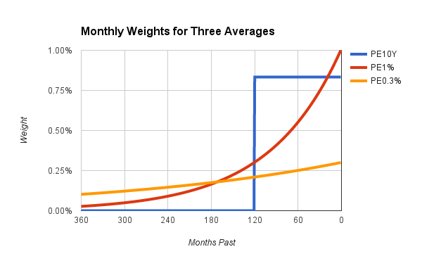
In the chart's blue line for PE10Y, the most recent 120 months all get a weight of 1/120 or 0.83%; every other month has zero weight. The red line for PE1% starts higher, with the current month getting a weight of 1%. Stepping backward in time, the weight gets reduced by 1% every month, simply by mutliplying the weight by 99%. After 240 months (2 years), the weight declines to about 0.1%. Over time, the monthly weight gets very, very small, but never exactly reaches zero. Finally, the orange line for PE0.3% starts quite low, with the first month weighted at 0.3%, which is less than half the weight that same month would get in PE10Y. The weight is multiplied by 99.7%, thus reducing it by 0.3%, marching ever backward into the past. Even 360 months into the past (30 years ago), the weight is close to 0.1%. Because of the curved, declining profile, the method used for PE1% and PE0.3% is typically called an "exponential average."
As it happens, after PE10Y and PE1% from 1896 to 2015 were subjected to the "logger" transformation (taking the logarithm of their respective median residuals), the resulting metrics were highly similar. Over the entire span of those 120 years, LogrPE10Y and LogrPE1% had virtually identical averages, medians, skew values, and standard deviations. They were also comparable at predicting future stock prices, as measured by explained variance.* You could, if you wish, use LogrPE10Y or LogrPE1% interchangeably.
As it happens, after PE10Y and PE1% from 1896 to 2015 were subjected to the "logger" transformation (taking the logarithm of their respective median residuals), the resulting metrics were highly similar. Over the entire span of those 120 years, LogrPE10Y and LogrPE1% had virtually identical averages, medians, skew values, and standard deviations. They were also comparable at predicting future stock prices, as measured by explained variance.* You could, if you wish, use LogrPE10Y or LogrPE1% interchangeably.
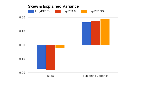
However, LogrPE0.3%, the longer, more gradual exponential average, did even better. Among all exponential averages in a comprehensive analysis of predictions ranging from 1 to 40 years,** LogrPE0.3% was the overall winner. As summarized in the chart above, its skew was closest to zero, and it had the highest predictive power (explained the most variance). Compared to the ordinary 10-year period, CAPE was more informative when, in effect, it had a longer but diminishing "memory" for past events.
Trend
Since 1896, CAPE has not varied randomly. Over periods of 20 years or so, it has tended to hover at negative, neutral, or positive levels, not wandering freely across the full range of potential values. The chart below demonstrates the non-random behavior, using LogrPE0.3% for CAPE. The plotted line is a fitted (cubic) polynomial. If CAPE were truly random, the line would be flat or nearly so.
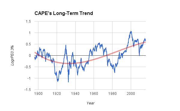
The trend shown in the chart poses some ambiguity about the proper interpretation of CAPE. For example, the dot-com peak in 2000 was double the size of any previous peak, when measured on raw values of LogrPE0.3%. However, when measured by the excess above trend, the extremity of 2000 was about the same as the 1929 peak. Making the interpretation even more difficult, the trend as of 2016 could look different when the fitted line is recomputed a decade or two in the future. If the fitted line were projected into the future, it would forecast a leveling-off, with today's CAPE becoming the "new normal." But, as Mark Twain famously observed, forecasting is hazardous, especially when you are trying to predict the future. It's just not clear whether current stock-prices are almost normal (compared to the trend line) or extremely over-valued (assuming zero to be normal).
Speculatively, one might view the long trend as a behavioral indicator. Perhaps investors get accustomed to high or low stock-valuations, causing the "normal" level of CAPE to rise during long-term bull markets and to fall during periods of prolonged economic distress.
Whatever the reason, the long trend suggests why the explained variance, reported in an earlier chart, is low. It's just 20% because the statistical model made no adjustment for the long trend. Realistically, invoking CAPE to predict future stock-returns or to design a portfolio is a rough approximation. Using it is better than ignoring it. And, although LogrPE0.3% is a "better CAPE," it offers modest improvements, not guarantees.
Follow-up posts examine how the "better CAPE" can be used judiciously to fine-tune an investment portfolio and to adjust realistic expectations of future returns. In doing so, the follow-ups give a deep-dive into the merits of de-trending CAPE and the inner workings of our calculators.
* In data of the sort used here, with overlapping time-periods, traditional statistical tests may be biased. Ang's book, in chapter 8, section 5.2, explains why. Thus, the absolute level of explained variance (R-Squared) should be taken with caution. That said, different methods of measuring CAPE were all subject to the same biases. Comparing the explained variance of the methods is probably correct directionally, if not in magnitude.
** Two sets of regression analyses were performed. In both sets, real (inflation adjusted) stock-returns were predicted from CAPE values, using monthly data from January 1896 to December 2015. For exponential averages, PE10Y in December 1880 was the starting value. Annualized stock-returns, with dividends reinvested, were computed for all annual holding periods from one to 20 years, and for all biennial holding periods from 22 to 40 years. In one set of analyses (reported here), the regression slopes and intercepts were forced to be constant across all holding periods. In a second set (to be covered in a future post), the regression parameters were allowed to vary for each holding period.
** Two sets of regression analyses were performed. In both sets, real (inflation adjusted) stock-returns were predicted from CAPE values, using monthly data from January 1896 to December 2015. For exponential averages, PE10Y in December 1880 was the starting value. Annualized stock-returns, with dividends reinvested, were computed for all annual holding periods from one to 20 years, and for all biennial holding periods from 22 to 40 years. In one set of analyses (reported here), the regression slopes and intercepts were forced to be constant across all holding periods. In a second set (to be covered in a future post), the regression parameters were allowed to vary for each holding period.

 RSS Feed