Able to Pay
  • News
  • Retirement
    • Retired Now
    • Retiring Soon
    • Saving to Retire
  • Goals
    • Ask Yourself
    • Building Wealth
    • Investing to Buy
  • Investing
    • Basic Methods
    • Rebalancing
    • Stocks or Bonds?
    • Investment Fees
    • Being Tax-Wise
    • Finding Advice
  • Portfolios
    • Basic Portfolios
    • How Long?
    • Diversify!
    • Factor Investing
    • Finding Value
  • Calculators
    • Best-Invest
    • Safe Payout
  • About

Major Revisions Underway

1/19/2021

0 Comments

 
Major changes are underway for this site:
  • Some content has been or will be migrated to my new site, likelyso.com. The theme of the new site is "Your Health, Your Money. Worthy questions. Likely answers."
  • All new posts appear at likelyso.com/blog.  A few of the posts listed below may be updated and migrated to the new site, but most will be archived.
  • Some pages, calculators, and historical posts have been or soon will be deleted permanently.
0 Comments

Rotation Portfolios as of August 1, 2019

8/1/2019

0 Comments

 
NOTE: For better, more current information about rotated portfolios, go to: likelyso.com/money.

My posts since June have used historical data to introduce rotation as way to manage a diversified portfolio of stocks and bonds. Today's post launches an ongoing series of updates that will review how rotation works in real time, month by month, on a sample set of portfolios. Initially, the updates will be posted here. In time, they will move to a subscription newletter.

Sample Portfolios
Some of the portfolios use low-fee Exchange-Traded Funds (ETFs) available in any brokerage account; others use low-fee mutual funds similar to those typically available in 401(k) and 403(b) retirement plans. The funds and ETFs track well-defined indexes or, in exceptional cases, use quantitative methods that limit the discretion of the fund's manager. Some of the portfolios use a short three-month window to decide which ETFs or funds to hold; others use a longer 12-month window.

The portfolios were constructed from simulations that used at least 25 years of monthly historical data. Going forward, actual performance will be updated once a month. A strict rule for all the portfolios is that any change in a portfolio's composition is held at least until the next monthly update.

The sample portfolios are organized in four groups, corresponding to four types of investment goals or risk tolerances. Today's updates provide one example in each group. Other examples will be added in coming weeks.
Picture
All-Max Portfolios
The dominant goal of an all-max portfolio is to maximize total return in the long run. It aims to hold equities rather than bonds, except when bonds are demonstrably performing better than equities. The guiding principle is to rotate out of stocks and into bonds when the total return of stocks, relative to that of bonds, has weakened, or vice versa. The portfolio may be 100% in stocks or 100% in bonds. However, if the portfolio has more than one equity ETF or fund, such as one for domestic U.S. companies and another for international ones, then it may sometimes hold a mixture of stocks and bonds. That may happen, for example, if U.S. equities are stronger than bonds, but international equities are not.

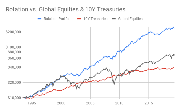
Today's example for this group, shown in the chart above, is All-Max Global Markets 100-to-0 ETFs. It is contructed from four ETFs that track broad indexes of domestic and international stocks and U.S. Treasury bonds. At a given time, each ETF is 0%, approximately 25%, or approximately 50% of the portfolio, with a 5% variance that triggers rebalancing. The ETFs and their current allocations are:
​
  • Vanguard Total Stock Market ETF (VTI). Now at 0%, its target level had been 25% in July.
  • Vanguard FTSE Developed Markets ETF (VEA): Its current level is 0%, as it has been since June 1.
  • Vanguard Long-Term Treasury ETF (VGLT): Its target level is 50% now, as it was in July.
  • Vanguard Intermediate-Term Bond Index ETF (BIV): Now at 50%, it received the proceeds from selling VTI on August 1.

A forthcoming post will provide details on a 25-year simulation of this portfolio. In markets without a steady trend, including most of the past year, the portfolio's three-month window for evaluating ETF performance may generate choppy results. However, over the past decade or longer, it has outperformed benchmarks such as Vanguard's LifeStrategy Growth Fund or the composite of global equities, as the chart demonstrates.
Mostly-Max Portfolios
In this group, the blended goals are, primarily, to maximize total returns and, secondarily, to minimize drawdowns. For partial protection against sudden drawdowns, a mostly-max portfolio always holds a minority of its assests in a bond fund or ETF. It aims to hold a substantial majority in equities when they are strong relative to bonds, rotating to 100% in bonds only when stocks have weakened.

For this group, today's example is Mostly-Max Low Volatility 80-to-0 ETFs. See my recent post for a 25-year simulation of this portfolio. It is composed of the following ETFs, whose target levels remain unchanged from last month:
​
  • iShares Edge MSCI Minimum Volatility USA (USMV). Currently 60%.
  • iShares Edge MSCI Minimum Volatility EAFE (EFAV). Currently 0%.
  • Vanguard Total World Bond ETF (BNDW). Currently 20%. It may rotate to 0% or to as much as 80%. BNDW holds equal portions of Vanguard's broad indexes for U.S. and international bonds.
  • Vanguard Long-Term Bond ETF (BLV). Always 20%, as a hedge against sudden drawdowns.

This portfolio compares ETFs on a 12-month window and therefore tends to hold a postion for many months. In a forthcoming post, a similar portfolio using mutual funds will highlight the performance of Vanguard's excellent Global Minimum Volatility Fund (VMVFX).
Picture
Mostly-Min Portfolios
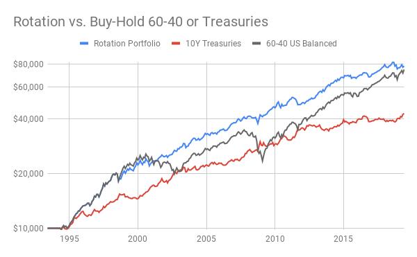
The blended goals of this group are, with high priority, to minimize drawdowns and, with less weight, to boost total returns. Today's example for this group is Mostly-Min US Balanced 60-or-0 Fund. As the chart above illustrates, the total return of this portfolio over the past 25 years has modestly exceeded a standard 60-40 mix of U.S. stocks and bonds. In doing so, the mostly-min portfolio avoided major drawdowns and matched the low volatility of 10-year Treasuries. The very simple strategy of this portfolios is always to invest entirely in one of three indexed mutual funds:
​
  • Vanguard Balanced Index Fund (VBIAX), which targets 60% in U.S. equities and 40% in U.S. bonds.
  • Vanguard Intermediate-Term Bond Index (VBILX), which invests 100% in diversified U.S. bonds. This fund has held 100% of the portfolio's assets since June 1.
  • Vanguard Short-Term Bond Index (VBIRX), which the portfolio occasionally uses for temporary holdings.

Normally, the portfolio rotates between the 60-40 balanced fund and the intermediate bond  fund. However, to limit flip-flops and to honor the restrictions on frequent trading that investment firms and retirement plans typically impose, the portfolio will, on rare occasions, hold all its assets in the short-term bond fund. A detailed post later this month will explain the mechanics and long-term performance of this portfolio, including details about when and why to hold the short-term bond fund.
All-Min Portfolios
Here the overarching goal is to minimize drawdowns in a portfolio that never has more than a minority exposure to equities. The example today is All-Min Global Income 30-or-0 Fund. It has a simple strategy of investing all its assets in one of three indexed mutual funds:
​​
  • Vanguard Target Retirement Income Fund (VTINX), which targets 30% in global equities and 70% in worldwide bonds, including some that are indexed to U.S. inflation.
  • Vanguard Intermediate-Term Treasury Index (VSIGX). All the portfolio's assets have been invested here since January, and remain so this month.
  • Vanguard Short-Term Bond Index (VBIRX). 

Normally, the portfolio holds either the 30-70 income fund or the intermediate Treasury fund for many consecutive months. However, to limit churn and honor restrictions on frequent trading, it may sometimes hold the short-term bond fund for a month or two. As will be documented in a forthcoming post, the rotation strategy of this all-min portfolio has, historically, achieved higher total returns with smaller drawdowns than investing exclusively and continously in either of its two main alternatives, the 30-70 fund or intermediate Treasuries.
Disclosures
These portfolios are presented for information only, not as investment advice. They are based on simulations that may not capture or reproduce every aspect of actual investing. Historical results are no guarantee of future performance. All investments are subject to risks. You may lose money, and your assets may be vulnerable to inflation. You are responsible for your own investment decisions.

Able to Pay LLC does not own, sell, or manage any of these portfolios. Alex Wilkinson may own similar portfolios in personal accounts.
0 Comments

Time to Rotate Out of Stocks?

7/1/2019

0 Comments

 
On June 3, 2019, my post What Now: Sell, Rebalance, or Rotate? launched an on-going series comparing rebalanced portfolios with a new strategy of rotation. On that date, a simple version of the rotation strategy caused a portfolio invested entirely in stocks to convert all its assets to U.S. Treasuries. On the date of this post, July 1, 2019, another instance of that strategy caused a traditional portfolio of 60% stocks and 40% bonds to switch to 100% bonds. This post describes how the rotation strategy works, using these two portfolios as examples.

Different Portfolios for Different Goals
The two portfolios are alike in some ways and very different in others. Neither portfolio is always invested in stocks or always in bonds. Both do both. Neither portfolio holds a static mix of stocks and bonds. Both vary their mixture over time. One of the two holds Exchange Traded Funds (ETFs) and may switch them several times a year. The other holds traditional mutual funds and imposes controls to limit turnover. Yet both portfolios use rotation to achieve better returns and substantially lower drawdowns than traditional alternatives.

The two portfolios are suited to investors with different goals.
Picture
Suppose your primary goal were maximize long-term gains, even at the risk of some turbulence. Then you might find the chart above to be compelling. It shows that, over various 25-year time-periods from 1919 to 2019, spanning a variety of countries and currencies, the strongest returns, adjusted for local inflation, came from rotating between a high ceiling of 100% invested in stocks and a low floor of 0% in stocks. Call it a max-gain strategy of 100-or-0 rotation. Historically, this strategy has managed to sidestep most of the damage of prolonged drawdowns in stock markets, such as happened most recently in 2008-2009. However, it is vulnerable to sudden one-month downturns, such as the October crashes that exceeded 20% in 1929 and 1987, and numerous months with losses approaching 10%, including the recent demise in December 2018.

If one-month losses of that magniture seems a bridge too far, then the goal of your journey as an investor might be a compromise between maximizing gains and minimizing losses. Your preference would be a minimax strategy, as illustrated in the next chart. Taking a different prespective on the same extensive data as the previous chart, this one shows that the best compromise imposes a ceiling of 50% to 60% in stocks and a floor of 0% in stocks. That's a minimax stategy of 60-or-0 rotation. (50-or-0 performs virtually the same.)
Picture
Two risk-controls are at work here. With a ceiling of 60% invested in stocks, your exposure during a sudden 20% downturn is reduced to 12%. Furthermore, with a floor of 0%, you have no exposure to the bulk of a long decline in the stock market, provided that you rotate from stocks to bonds early in the decline. ​

To map out the routes of these financial journeys, let's examine the two specific portfolios that used rotation to switch from stocks to bonds on June 1 and July 1 this year.

Max-Gain Rotate 100-or-0
​This portfolio aims to maximize gains by moving its assets across three basic index funds. The moves occur, on average, about four times per year, possibly with tax consequences if executed in a taxable account. Since 1996, the portfolio has never held the same assets for a full year, though it occasionally came close. At a given time, it is invested entirely in one of three indexed ETFs:
  • The entire U.S. stock market, via Vanguard Total Stock Market ETF (VTI) or a similar low-cost fund such as iShared ITOT.
  • Non-U.S. stock markets as represented by Vanguard Total International Stock ETF (VXUS) or a similar low-cost ETF such as State Street SPDW.
  • Long-term U.S. Treasuries with average durations close to 20 years, as represented by Vanguard VGLT or alternatives such as iShares TLT or TLH.

The portfolio's strategy is to review these index ETFs at the end of every month, and invest entirely in the one whose three-month total return is the highest. On June 30, 2019, using the Vanguard ETFs, long-term Treasuries ranked first at 5.71%; U.S. stocks were next at 4.08%; and international stocks were last at 2.80%. Because the portfolio had previously moved all its assets to Treasuries on June 1, 2019, no change was indicated for July.

Historical results for this portfolio can be closely approximated by Vanguard mutual funds whose indexes match the firm's current ETFs. For the 23-year period from July 1, 1996, to June 30, 2019, the hytpothetical performance of the three mutual funds, had it been possible to trade them like ETFs, would have been as shown in the chart below. One line in the chart shows the rotation strategy for Max-Gain Rotate 100-or-0. A second line compares the results of investing equally in the same three funds, 33.3% each, and rebalancing them at the end of the month if the allocation's total drift exceeds 5% (as when a fund in this portfolio went above 38.3% or below 28.3% of the portfolio's total value).
Picture
The rotated portfolio was superior to the rebalanced alternative in measurable ways. It had a bigger nominal return (14.7% vs. 7.6%) and a superior risk-adjusted return (7.5% vs. 0.5%). To reap these substantial benefits, however, one had to endure a maximum drawdown that was large (-18.8%). Painful as it might have been, that drawdown was mild compared to the rebalanced portfolio (-36.4%). 

Minimax Rotate 60-or-0
To place stronger limits on drawdowns, Minimax Rotate 60-or-0 accepts returns that are less stellar, though still very good. This strategy may be suitable both for taxable accounts and for IRA and 401k savings. On average, the portfolio has had one change per year since 1995, although it had a few of them in some years and occasionally went without a change for two years or longer. At a given time, the portfolio is invested entirely in one of two ways:
  • A mutual fund that holds 60% U.S. stocks and 40% U.S. bonds, such as Vanguard Balanced Index Admiral Shares (VBIAX) or equivalent all-U.S. funds.
  • A broad mix of 5-to-10 year U.S. corporate and Treasury bonds, such as Vanguard Intermediate-Term Bond Index Admiral (VBILX) or the equivalent. 

The portfolio's strategy is to review the performance of these two funds bimonthly (at the end of even-numbered months) and invest in the one whose total return is better over the previous 12 months. The bimonthly schedule reduces the portfolio's churn and honors the one-month limit that investment firms typically place on selling and repurchasing the same mutual fund. On June 30, 2019, the 12-month total return was better for the bond fund (VBILX, 9.99%) than for the balanced fund (VBIAX, 8.91%). A month earlier, the opposite was true. Hence the portfolio moved all its assets to the bond fund on July 1, 2019, to be left there for at least two months.
Picture
The chart above shows results based on the longest available history of the two Vanguard mutual funds (VBIAX and VBILX) from March 1, 1995, to June 30, 2019. The rotation strategy successfully side-stepped long declines during the dot-com collapse of 2000-2003 and the severe recession of 2008-2009. The traditional 60-40 index fund did not. Consequently, the biggest drawdown of the Minimax Rotate 60-or-0 portfolio was much smaller (-13.0%) than that of Vanguard's 60-40 fund (-32.6%). And recall that the max-gain strategy had a drawdown of -18.8% for the same period.

Yet, as the chart shows, the minimax strategy also met its other objective of generating decent returns. Though less amazing than the max-gain portfolio, minimax rotation did somewhat better than traditional 60-40 rebalancing (8.5% vs. 8.2% in nominal returns). In short, when compared to other alternatives, minimax rotation did indeed produce commendable gains at a notably lower cost in drawdowns and churn.

Some Technical Details
To understand the measurements and data underlying the charts and analysis in this post, see my posts last month, especially Best Options to Minimize Drawdowns and Floors and Ceilings, Part 2.
0 Comments

Best Options to Maximize Returns

6/26/2019

1 Comment

 
My previous post examined ways to minimize drawdowns in a portfolio. This one turns the table to study how best to maximize returns.

Admittedly, it's not a clean dichotomy. When analyzing drawdowns but confronted with portfolios that impose similar limits on them, the urge is strong to see how the portfolios compare on returns. The same urge will sneak into the storyline here. Focusing primarily on portfolio returns, I'll admit some consideration of drawdowns if the returns are not decisive. 
Picture
100 Years of Large-Cap Stocks in the U.S.
Shown in the chart above are key findings for large-cap stocks in the U.S. between April 1919 and March 2019. As I've noted previously, different 25-year segments of this period exhibited dramatically different results for investors. Yet across all the historical variations of that century, the trends captured in the chart were consistent. Looking closely, you can see three of them.
  1. The pair of bars on the left show that holding a high percentage of the portfolio in large-cap stocks paid sizable real returns in the long-run. These returns are annualized and adjusted for inflation. The two portfolios represented by the bars on the left were 100% invested in stocks all or most of the time.
  2. On the other hand, the pair of bars on the right show that if you adjust for the risk of drawdowns, then the relative returns of these portfolios were modest. A relative return is the portfolio's surplus over investing 100% in 10-year Treasuries, after compensating for the portfolio's incremental risk of drawdowns. The risk-adjusted bars on the right show that the same stock-heavy portfolios were barely a percentage point or two better than 10-year Treasuries. For the additional risk taken, the reward was limited. (An earlier post explains how I calculate relative returns.)
  3. Finally, the color-contrast in the chart compares two methods of portfolio management. The blue bars show the average outcome of buying and holding large-cap stocks for a full 25-year cycle. The red bars average the same 25-year periods, but within a period, the portfolio's holdings rotate between being completely in large-cap stocks or wholly in 10-year Treasuries. The criterion for deciding whether to hold equities or Treasuries is the total return of those two assets in recent months (as explained in What Now: Sell, Rebalance, or Rotate? and in Best Options to Minimize Drawdowns). The message of the color-contrast in the chart is that rotation delivered better outcomes than buy-and-hold, because it more effectively controlled the risk of drawdowns.

"What about rebalancing?" you might ask. Was there a portfolio that rebalanced large-cap stocks and 10-year Treasury bonds to achieve best-in-class returns? The answer for the U.S. was, "No, not with any consistency." In three of the four 25-year periods since 1919, no rebalanced portfolio outperformed one that bought and held large-caps for the duration. In one case alone, 1919 to 1944, it was a close call. Then, rebalancing 90% in stocks against 10% in Treasuries ended in a dead-heat with 100% in stocks, as both methods had real returns of 7.3% and relative returns at 4.4%.

25 Years of Large-Cap Stocks in Germany, Japan & Australia
The results in other countries, however, were sometimes different from the U.S. In a post titled Does Rotatation Work in Global Markets?, I showed recent 25-year returns in three other countries, with local large-cap stocks and local 10-year Treasuries, invested in local currencies, adjusted for local inflation. In two of the countries, Germany and Japan, Treasuries outperformed the relevant large-cap index, and in the third, Australia, they almost did.
Picture
If you believe an oft-cited legend that stocks always beat bonds for holding periods longer than 20 years, this is not supposed to happen. But it did there, implying that it could here. In the unlikely event that you might foresee this outcome in advance, you could elect to rebalance a portfolio to target levels of 25% in stocks and 75% in Treasuries. As shown in the chart, doing so for Germany, Japan, and Australia between 1994 and 2019 yielded better real returns than any other rebalanced portfolio and, on average, also bested an all-stocks portfolio in those countries.

Even better results would have accrued by using the rotation strategy, placing 100% in large-caps when their recent total returns were temporarily better than local 10-year Treasuries and otherwise investing all the portfolio's assets in those Treasuries. Happily, for this strategy, you don't have to guess whether stocks or bonds will be stronger in the future. You simply adapt to whichever has been stronger in recent months.

A cautionary note, however, is that all the foregoing comments are limited to real returns. For relative returns, which adjust for the risk of drawdowns, the results were, to be blunt, pathetic. Considering the risks taken, no strategy that invested in stocks in these countries was much better, in the last quarter-century, than one that bought and held 10-year local Treasury bonds.

25 Years of Low-Volatility Stocks Worldwide
For completeness, should low-volatility stocks be considered when the goal is to maximize returns? It makes sense to consider them when trying to limit drawdowns, because by design, stocks chosen for their low volatility should, theoretically, fall less than the average equity when the stock market takes a tumble. On the upside, however, an advantage for low-volatility stocks is not obvious.

Empirically, academic research implies that such an advantage may exist (as reviewed, for example, in Andrew Ang's textbook on asset management). In the research, when equities were selected for a portfolio because their price-fluctuations were low or because they were weakly correlated with market averages, the studies reported that the portfolio's returns approximated or modestly exceeded those of the full stock market, even when it was rising.

​Accordingly, the next chart summarizes results averaged across three indexes of low-volatility stocks from April 1994 to March 2019. The indexes are tracked by iShares ETFs for the U.S., for developed countries outside the U.S., and for stock-markets globally. The trading histories of the ETFs were too short for this analysis, which was based instead on the index histories in U.S. dollars and on U.S. 10-year Treasuries.
Picture
On close inspection, several aspects of this chart are noteworthy.
  1. ​​First, as in the academic research, a 6.8% real return for these low-volatility indexes over the last 25 years compared favorably to the 7.2% real return of large-cap U.S. stocks over a much longer history, which was shown in the first chart in this post.
  2. Once again, the rotation strategy outperformed buy-and-hold.
  3. Perhaps surprisingly, the relative returns for these low-volatility indexes were quite good on the upside. They did double-duty, in effect, generating stock-like returns while handily limiting the risk of drawdowns.
  4. Rebalancing low-volatility stocks would not have been the method of choice for maximizing returns. At its best settings, rebalancing yielded just 4.6%, well below the levels attained for buy-and-hold and rotation. Furthermore, when adjusted for risk, it was unremarkable, like its counterpart in the analysis of Germany, Japan, and Australia. That said, if one's goal were to limit drawdowns with minimal effort, rebalancing 25% in low-volatility stocks against 75% in intermediate Treasuries would be attractive.

Key Takeaways
  1. If you aim to maximize returns, ask whether you are willing to exert the discipline and monthly effort to apply the strategy of rotation. If so, rotating well diversified, low-volatility ETFs may generate the best risk-adjusted returns. Rotating broad-market averages should also reward you for the risks taken, scoring slightly higher than low-volatility ETFs on real returns but slightly lower on risk-adjusted ones.
  2. Buying and holding stocks may often deliver better returns than buying and holding Treasury bonds, provided that the holding period is very long. Often. But not always! Even at 25 years, there are historical cases where long-held Treasuries have beaten long-held equities.
  3. Rebalancing is not optimal for maximizing returns. As a strategy, its best application may be for goals that aim to reduce drawdowns.
  4. A big caveat: For a goal that seeks a compromise between maximizing returns and minimizing drawdowns, the analysis in this post offers no guidance. That's coming in my next post in this series.
1 Comment

Best Options to Minimize Drawdowns

6/24/2019

0 Comments

 
Suppose, as an investor, your goal is to craft the portfolio that, among all possible options, has the lowest risk of potential drawdowns. You might appreciate that any portfolio can suffer losses, even normally safe Treasury Notes. After all, during times like the world wars and Great Depression of the twentieth century, and in the recent aftermath of the 2008-2009 recession, Treasury departments (not to mention stingy banks) have been known to pay interest below the inflation rate. In doing so, they can inflict hidden losses that diminish your buying power, while pretending to offer positive returns.

Still, for short term expenses to be paid within a year or two, Treasury Bills, money market funds, and bank savings accounts are the best choice. They may not be optimal, however, if you have a longer horizon for spending down your assets. Relevant scenarios might include a reserve or emergency fund, a health savings account, or a portfolio in which you are accumulating assets for a major purchase, such as the downpayment on a future home.
Picture
For these purposes, where the spending dates are indefinite or a few years away, an ideal portfolio would generate minimal drawdowns while offering a reasonable potential for  assets to grow. What are the best ways to construct such a portfolio? The historical results of some good options are summarized in the chart above. It compares large-cap stocks to the average of several low-drawdown portfolios. The data for the chart cover various countries, time periods, and methods of asset-management. All the methods that are averaged together in the chart drastically reduced drawdowns. Some of them achieved returns rivaling those of large-cap stocks. The effort they might require from you to manage your funds would range from virtually none to a modest, once-monthly review. This post reveals the details behind the average results in the chart, explaining how low-drawdown portfolios can be built and how they have performed historically.

Portfolio Options
To analyze the historical data, I designed portfolios to simulate risk-averse investors who chose to do one of the following:
  • Invest entirely in Treasuries. As in my other posts, constant maturity,10-year Treasuries were used for this purpose. They correspond closely to mutual funds and ETF's that hold intermediate-term government securities. Except for periods when government policies or unusual financial conditions force interest rates to fall below the current inflation rate, 10-year Treasuries should be quite safe. Investing in them is the default choice, the benchmark against which all other low-drawdown portfolios are measured.
  • Combine 10-year Treasuries with large-cap stocks. The rationale for this option was that diversifying a portfolio to include a small to moderate portion of equities should strengthen it. Treasuries and stocks tend to have a slightly negative correlation. In times when Treasuries fall in value, stocks may rise, on average. The key question is how much to invest in stocks to get just the right amount of compensation for the occasional weakness of Treasuries.
  • Combine 10-year Treasuries with low-volatility stocks. When one's goal is to limit the drawdowns in a portfolio containing some equities, it would seem reasonable to favor the stocks that are least inclined to fall when the overall market plunges. This option is new, as mutual funds and ETFs for low-volatility stocks have become available only very recently. For most such funds, the available history is meager. Fortunately, one excellent set of data has worldwide low-volatility indexes with 25 years of history, just enough to match the 25-year periods analyzed throughout the series of posts that began here on June 3, 2019. (For specifics, see the section below titled "Some Technical Details.")
Given portfolios containing both Treasuries and stocks, the historical analysis examined two ways in which one might manage the portfolio's assets:
  • Rebalancing. Set a target for the percentage of stocks to be held. Monitor the portfolio monthly, and, if it has drifted 5% or more from the target, exchange assets to restore the balance. For example, if the target is 15% but the current level has risen to 20% or fallen to 10%, restore the portfolio's funds to the 15% target. 
  • Rotation. Set a ceiling for the percentage of stocks held in the portfolio during times when, compared to Treasuries, stocks have been performing well. Also set a floor for the percentage of stocks to be held when stocks have been performing worse than Treasuries. Once a month, compare the total return of stocks and that of Treasuries, over a window of a few months, and respond accordingly. For example, suppose that the ceiling were 80% and the floor 20%; that this month's review showed Treasuries to be doing better than stocks; and that last month's review showed the opposite. Then you would exchange funds to move from last month's ceiling of 80% stocks to this month's floor of 20%. In general, each monthly review would dictate one of three actions:
    1. Exchange funds to match the desired floor or ceiling value, if the recent total returns of stocks and Treasuries indicate a switch, or ...
    2. Rebalance to maintain the current allocations, give or take 5%, or ...
    3. Do nothing if this month's better-performing asset is the same as last month's, and the portfolio's allocations are within 5% of the intended values.

Best Options
The chart below shows drawdown metrics for multiple portfolios, across a variety of countries and time-periods. Although the data and results are multi-faceted, the main message is quite simple. Compared to an all-stocks portfolio, several excellent portfolios reduced drawdowns significantly, all of them by nearly the same amount, over the historical spans of this analysis.
Picture
The left half of the chart aggregates the same data-sets as in my other recent posts: large-cap stocks and 10-year Treasuries across four 25-year periods for the U.S. since 1919, in dollars, and the most recent 25-year period for Germany, Japan, and Australia, in their local currencies. The right half adds the most recent 25-year period for a global stock index (in dollars); the same period for US 10-year Treasuries; and the average over that time of three low-volatility indexes, one for the U.S., another for developed countries outside the U.S., and the last for worldwide stocks including the U.S. (See "Some Technical Details" below.)

Both sides of the chart show drawdowns measured three ways: the maximum cumulative decline within a 25-year period, the worst single month in that period, and the average accumulated loss for all months when the portfolio's value was falling.

As would be expected, portfolios invested 100% in stocks had big drawdowns, despite achieving good cumulative returns in the long run.  Their maximum drawdowns in 25 years averaged -55%. Their worst-month drawdowns and their average on-going drawdowns  were between -15% and -20%.

On all these measures, the low-drawdown portfolios excelled. Their maximum cumulative loss during a 25-year period was consistently better than -10%; the worst-month drawdown was, on average, between -4% to -6%; and the average on-going loss during periods of decline was -2% to -3%.

The next chart shows additional measurements for the best portfolios:
  • ​Drawdown Reduction: This value is the percentage by which a portfolio avoided the losses of an all-stocks portfolio for the same country or region and the same 25-year period.
  • Real Return: This metric for a portfolio's performance included reinvestment of dividends and interest, and was adjusted for local inflation over the relevant time-period.
Picture
 Let's examine these portfolios one by one:
  • 10YTreas Local. Results summarized in the two left-most bars in the chart came from investing 100% in 10-year Treasuries, both from 1919 to 2019 in the U.S. and from 1994 to 2019 in Germany, Japan, and Australia, always in local curriences. The maximum, worst-month, and average drawdowns of these all-bond portfolios were, on average, 81% better than investing locally in large-cap stocks. The total returns were 3.2% above local inflation.  A comparable all-stocks portfolio, with its large drawdowns, would have had better returns, but not hugely so (4.9%, not shown in the chart).
  • Rebalance LC 10%. Portfolios under this heading rebalanced 10% in local large-cap stocks and 90% in local 10-year Treasuries, over the same countries and time-periods. The reduction of drawdowns was slightly better than all-Treasuries (83% vs. 81%), as was the real return (3.6% vs. 3.2%). Results nearly as good would have accrued if the rebalanced allocation to stocks had been 15%. In short, with rebalancing as the strategy, a modest allocation to local large-cap stocks had slightly less risk and better returns than investing entirely in local 10-year Treasuries.
  • Rotate LC 30-or-10. Across a comprehensive set of rotation strategies, the best performance for the same countries and 25-year periods resulted from swapping between a ceiling of 30% and a floor of 0% in local large-cap stocks. Over time, this strategy averaged about 19% in stocks and 81% in local Treasuries (with the time in stocks occurring only when they had done better than Treasuries over a recent three-month window). This portfolio, too, outperformed the all-Treasuries benchmark, reducing drawdowns comparably (82% vs. 81%) and achieving better real-returns by a good margin (4.7% vs. 3.2%).
  • 10YTreas US$. To evaluate low-volatility ETFs from 1994 to 2019, the analysis emulated the behavior of an investor in the U.S. In effect, the analysis used dollars to purchase U.S. and international low-volatility ETFs, and compared the results to investing dollars either in U.S. Treasury bonds or in a worldwide index of stocks in all developed countries including the U.S. As shown in the chart above, a portfolio of 10-year U.S. Treasuries held for 25 years, starting in 1994, reduced drawdowns by 77%, compared to investing entirely in worldwide stocks for the same period. While the return of the all-equity index exceeded U.S. inflation (5.2%, not shown in the chart), the U.S. Treasury benchmark also did well (3.5% above U.S. inflation). 
  • Rebalance MV 25%. When applied to minimum-volatility indexes for large-cap and mid-cap stocks, the rebalancing strategy that generated the smallest drawdowns had an allocation of 25%. That's notably higher than the allocation of 10% that best reduced drawdowns for all large-cap stocks. Rebalancing to 25% for minimum volatility reduced drawdowns more than investing in benchmark U.S. Treasuries (82% vs. 77%). It also generated better real returns (4.6% vs. 3.5%).
  • Rotate MV 40-or-15. For the rotation strategy, the combination of floor and ceiling values that best limited drawdowns was 40% at the ceiling and 15% at the floor. Over the most recent 25 years, drawdowns were reduced 84% by the strategy of swapping between 40% and 15% in minimum volatility indexes while investing the remainder in U.S. Treasuries. Real returns were the best of all methods (5.3%), much better than the benchmark for Treasuries (3.5%) and on par with buying and holding all stocks in the worldwide index (5.2%, not shown in the chart).

Key Takeaways
If your primary goal is to limit drawdowns on investments to be spent more than a year or two in the future, several good options are available. The choice between them may depend on how much effort you are willing to put into monitoring and managing your portfolio.
  1. As a hands-off, low-effort method, investing entirely in local, intermediate-term government securities, comparable to 10-year Treasuries, is certainly a good choice. It is likely to generate better returns than bank deposits or money-market funds, to stay ahead of inflation in most periods, and to suffer drawdowns only temporarily and modestly. That said, this strategy is not completely risk-free. The cautionary counterexample is 1944 to 1969 in the U.S., when 10-year Treasuries fell behind inflation by -0.7% per year, resulting in a cumulative 16% loss in buying power over the 25-year period.
  2. Rebalancing requires a bit of work. If done with a low allocation to stocks, around 10% to 15%, it can be safer than the all-Treasuries method, and it may generate modestly better returns. It certainly seems worth the effort (and possibly worth the expense, if you get your investment firm to do the work).
  3. Rotation, like rebalancing, will require you to monitor your portfolio every month. The necessary effort is probably not much more than doing your own rebalancing. To limit drawdowns, the best settings for the rotation strategy were competitive with Treasuries and with rebalancing. Significantly, rotation bested all other strategies on real returns. (For more examples, see Rotating Out of Harm's Way and Does Rotation Work in Global Markets.)
  4. Low-volatility funds seem particularly well-suited for portfolios whose goal is to minimize drawdowns. Had you opted for rebalancing, you would have had better returns at no additional risk by targeting 25% in minimum-volatilty stocks than by maintaining 10% or 15% in large-cap stocks. A similar advantage for minimum volatility stocks also held, over the most recent quarter century, for the rotation strategy.
Some Technical Details
Information about technical details in an earlier post in this series apply to the findings reported here. Additional details follow.
  1. Only monthly data was available for some of the countries and time-periods in this analysis. For monthly rebalancing, a threshhold of 5% works well. Had weekly data been available, the preferred method would have been to check weekly and rebalance if the drift surpasses 3%. See my article on rebalancing for a comprehensive analysis.
  2. In the results reported here, the window for rotation was three months, unless specifically stated otherwise. However, in findings not displayed here, windows from two to six months often performed similarly in the long run. For some purposes, longer windows up to one year may be advisable for some investors, e.g., to limit churn that might have tax-consequences.
  3. The low-volatility indexes were from MSCI, for the period from April 1994 to March 2019. These indexes underlie three ETF's offered by iShares: USMV for medium-to-large U.S. companies, EFAV for medium-to-large companies in developed countries outside the U.S., and ACWV for companies in both developed and developing nations worldwide. Although the underlying indexes have a quarter-century of data, the ETF's have traded publicly for far less time. Were you to consider only the shorter trading history of the ETFs, you might conclude that buying and holding low-volatility ETFs at a high percentage of your portfolio would be a very safe strategy, even better than holding all-Treasuries. However, the trading history includes no major collapse in stock prices, such as the dot-com bust of 2000-2003 and the deep recession of 2008-2009. During those periods, the indexes had substantial drawdowns, averaging -40%. Using the 25-year index history, instead of the shorter ETF history, captured drawdown risks of this magnitude.
  4. Drawdown metrics were calculated as follows:
  • Maximum Drawdown: For each month in a 25-year period when the portfolio's value is lower than it's previous peak in the period, calculate the percentage loss. Over the entire 25 years, calculate the maximum of this monthly value.
  • Worst 1-Month Drawdown: For each month in a 25-year period, calculate the percentage change in the portfolio's value compared to the previous month. Find the minimum of these values.
  • Average Drawdown: For each month in a 25-year period, calculate the percentage change in the portfolio's value compared to the previous month. For all months in which this value is negative, calculate the average.
  • Drawdown Reduction: For a 25-year period, find the Maximum Drawdown, Worst 1-Month Drawdown, and Average Drawdown values for a portfolio invested entirely in a reference set of stocks, designated as m(s), w(s), and a(s), respectively. Find the same values for a comparison portfolio, designated as m(c), w(s), and a(c), respectively. Then calculate the average of 1 - m(c)/m(s), 1 - w(c)/w(s), and 1-a(c)/a(s).
0 Comments

Does Rotation Work in Global Markets?

6/12/2019

0 Comments

 
Earlier posts this week compared rebalancing and rotation across time in a single country: 100 years in U.S. markets. Today's post takes a turn, pivoting to hold time steady while examining a varied set of countries. Time is constrained to the last 25 years; the countries are Germany, Japan, and Australia. While not having the last word, recent experience in these global markets closes one important chapter in the story that began on June 3 when I asked, What Now: Sell, Rebalance, or Rotate?
Picture
At first glance, the averages over the three countries seem familiar. The biggest drawdowns were for large-cap stocks; the smallest ones, for local 10-year Treasuries. Smoother results came from rebalancing 60% in stocks and 40% in Treasury bonds, while tempered drawdowns and the best inflation-adjusted returns were definitive for 100-or-0 Rotation. Underneath the averages, however, investors in the three countries had very different experiences in the last quarter-century.
Picture
Of the three, Germany most closely resembled the U.S. from 1994 to early this year. Stocks rose overall, though the German DAX had a deeper drawdown (-68%) than did the American S&P 500 (-51%). Bonds were more competitive with stocks in Germany, enabling a portfolio that rebalanced 40% local Treasuries against 60% local stocks, all in local currency, to keep pace with an all-stocks portfolio. While these strategies took their different paths to similar destinations, 100-or-0 Rotation ultimately found a way to take investors even farther in Germany (8.7% annualized, adjusted for local inflation) than did the same strategey in the U.S. over the same years (7.4%).
Picture
Japan's experience was sadly unique. Stocks were mostly underwater for the last 25 years. Though inflation was low, the Nikkei 225 barely kept up with it, even with dividends reinvested. Bonds and the 60-40 portfolio managed to finish about 3% and 2% above inflation, respectively, in their characteristic ways:  paddle-boarding with local Treasuries behind the harbor breakwall; and boogie-boarding to catch big surf the 60-40 way, not quite so daring as air-freaking stocks. Outmanuvering all others, once again, was 100-or-zero Rotation, which rode the good waves and avoided the rest.
Picture
Yet another distinctive pattern transpired in Australia. Nominal interest rates for local 10-year Treasuries were higher in Australia (averaging 5.7% from 1994 to 2019) than in the other countries (3.9% in Germany, 1.9% in Japan, and 4.4% in the U.S.). Had Australian investors appreciated that local inflation was tepid (2.5%), they would have been wise to prefer their Treasuries, whose 25-year run exceeded both the AX 200 index of stocks, with reinvested dividends, and a 60-40 rebalanced portfolio. The strategy of 100-or-0 Rotation was sometimes the worst, though not by much. In the end it eaked out a small victory.

Good as it was overall, 100-or-0 Rotation exhibited at least one consistent vulnerability. For the worst-month metric, it always finished in third place, better by far than stocks, but outdone both by bonds and by rebalancing. There's a simple explanation, and it has a clear message. If a strategy is 100% invested in stocks when stocks fall suddenly and dramatically in a very short period, as on Black Monday in October 1987 and in the flash-crash of 2010, then the portfolio gets the full effect. However, a portfolio invested partly or completely in Treasuries will partly or completely escape the damage. Furthermore, Treasuries will very likely rise in value at such times.

The natural question to ask is whether a better rotation would stay below some ceiling, never going to 100% in stocks. A related question might be whether 0% is, in fact, the best floor. Happily, the data of the last 100 years in U.S. markets and the last 25 internationally have clear answers for both questions. Next week's posts will show how the answers are derived.
0 Comments

Rotating Out of Harm's Way

6/10/2019

2 Comments

 
Yesterday's post showed how four investment strategies handled two consecutive 25-year periods between 1944 and 1994, for stocks and bonds in the U.S. Today I'll examine the same strategies over two additional 25-year periods, bookending the previous ones and thus spanning a full century. The first period, 1919 to 1944, had the Great Depression; the second, 1994 to 2019, had the dot-com crash and the Great Recession. Truly, those were stress-tests for any portfolio.

The two charts below capture the main points of interest. (Or, to follow the story-line from the beginning, go back to my June 3 post, What Now: Sell, Rebalance, or Rotate?)
Picture
Had you held the S&P 500 (or something similar) throughout the bull market of the 1920's, the dreadful 1930's, and much of World War II, you would have suffered two big drawdowns. The killer, exceeding -80%, took three excruciating years from 1929 to 1932. Another, in 1937, was swifter and, at -41%, must have felt almost as frightful. Look, too, at 60-40 rebalancing! It offered no shelter, hugging the all-stocks portfolio as if in numbed desperation.

Treasury bonds, by comparison, gave an astoundingly smooth ride, perhaps because the bond-market was less mature than it is now or, more likely, because the U.S. Treasury controlled interest rates in a much different manner than the Federal Reserve has done since the 1950's. Yet, as good as the all-Treasury portfolio might have been, it was easily surpassed by 100-or-0 Rotation, a strategy that went all-in on stocks when their recent trend was better than 10-year Treasuries, and all-in on those same Treasuries when they had lately been the better of the two options. In this analysis, "lately" means, very simply, not last month, but the last several.
Picture
A half-century later, remarkably similar patterns began to emerge, like old music found in tattered manuscripts and replayed on new instruments. From 1994 to 2009, stocks had a bull market whose brassy boasting was soon silenced by a da capo of drawdowns. For its part, a 60-40 rebalanced porfolio held close to the rhythm of stocks. Treasuries made steady progress, while moving to a subdued drumbeat. Once again, a portfolio of 100-or-0 Rotation avoided firm commitments and, charmingly fickle, danced with each month's better partner. Doing so, it largely side-stepped the worst moments and outdid all others.

Taken together, the four 25-year periods shown in today's and yesterday's posts constitute a statistical sample. Averaging measurements across the four intervals generates an estimate of the outcomes one might expect in future quarter-centuries. For example, an average of the four maximum drawdowns will estimate the expected maximum drawdown in any future 25-year period.

Estimating in this way is more useful than simply calculating the maximum drawdown over the past 100 years. You and I won't be investing for 100 years.  The expectation for any 25-years, based on an admittedly small sample of four, is statistically more reliable and pragmatically more relevant than an expectation for 100 years, based on an even smaller sample of one.

Accordingly, the summary chart below shows several expected outcomes for future quarter-centuries. It also compares expectations across the four investment strategies.
Picture
Were you to invest entirely in the S&P 500 over the next 25 years, you should brace for a drawdown of about -48% at some point, plus a bad month with a paper loss of -19%, as you march toward an eventual inflation-adjusted annual return of 7%. In short: nice gains, big pains. Investing entirely in 10-year Treasuries would likely have much smaller drawdowns  of -9% at the low point and -5% in the worst month, but your gains would be correspondingly reduced to about 2% or 3% more than inflation. A typical plan of 60-40 Rebalancing would reduce the pain of drawdowns, compared to the S&P 500, while also sacrificing some gains. Best of all, however, would be 10-or-0 Rotation, which could be expected to generate better gains than the S&P 500 and smaller drawdowns.

My next post will apply the same four portfolios to countries outside the U.S., for the most recent 25-year period.
2 Comments

Rebalance or Rotate? The U.S. Since 1919

6/10/2019

0 Comments

 
Historically, you would have gotten good returns by simply holding a target percentage of your portfolio in stocks over many years, keeping the rest in 10-year bonds, and rebalancing periodically if the percentages drifted from your target. However, you would have suffered many drawdowns, sometimes extreme, lasting months or years. A week ago, I gave some examples as part of a series that started with my June 3 post for current U.S. markets, What Now: Sell, Rebalance, or Rotate? 

This week's posts will introduce rotation as an an altenative to rebalancing. Today's examples are for U.S. stock and bond markets dating back to 1919. Four investment strategies are applied to this 100-year period:
  • 100% in the S&P 500, with dividends reinvested.
  • 100% in 10-year Treasury bonds with interest reinvested.
  • 60% in the S&P 500 and 40% in 10-year Treasuries. At the end of each month, either reinvest the income in its source or, if the percentage in stocks has drifted to 55% or 65%, then rebalance stocks and bonds to their respective targets.
  • Either 100% in the S&P 500 or 100% in 10-year Treasuries, according to their recent performance, checked at the end of each month.
Comparing the strategies over the 100-year period from April 1919 to March 2019, 60-40 rebalancing and 100-or-0 rotation were virtually identical in one key way: over the long term, their equity exposures were virtually the same, 60.9% for rebalancing and 60.6% for rotation. In both cases, the portfolio tended to drift more toward stocks than toward bonds. For rebalancing, the long-term exposure to stocks was therefore slightly above the target of 60%. For rotation, the similar outcome over the full 100 years is an interesting coincidence. However, over shorter 25-year intervals, the stock-exposure of 100-or-0 rotation was variable.
Picture
Between 1944 and 1969 (depicted above), 100-or-0 rotation was 69% in stocks, on average. That happened because during these years, stocks strongly outperformed bonds. (See this earlier post for some possible reasons.) Then, continuously holding 100% in the S&P 500 would have been the best strategy; rotation often avoided bonds and thus out-performed rebalancing; and Treasuries were exceptionally weak, actually falling behind the inflation rate.

The next 25 years told a different story, as illustrated below. A sharp recession in the mid-1970's, followed by high inflation and high interest rates, then by prolonged rate cuts, combined overall to make the total return of bonds competitive with stock-returns. The strategy of 100-or-0 rotation responded in kind, allocating even-handedly, with an average stock-exposure of 53%. For the full 25 years, rotation beat all the other strategies, not by putting all its eggs in one basket, or by juggling two baskets at all times, but by opting periodically for the basket that better suited the changing financial environment.
Picture
The four 25-year periods since 1919 exhibited a variety of environments, including the two described above; the bull market of the 1920's and Great Depression of the 1930's; and the dot-com bubble, Great Recession, and recent bull market of the 21st century. Across it all, if given 25 years, a strategy of 100-or-0 Rotation ...
  • Beat 60-40 Rebalancing, every time
  • Beat 100% invested in the S&P 500, three of four times
  • Beat 100% placed in 10-year Treasuries, every time
  • Beat inflation handily, for every 25-year period

In forthcoming posts, I'll continue this introduction to rotation as an investment strategy, examining questions like these:
  • Using both raw returns and risk-adjusted metrics, how did rotation fare across 25-year periods and across countries?
  • What about drawdowns, as in "flash-crashes" and major recessions? Did rotation handle them better than rebalancing?
  • Is 100-or-0 the best way to do rotation, at all times and for all investors? Or would less drastic exchanges be better, depending on circumstances?
Finally, regarding how, exactly, to implement a rotation strategy, I will get there in due course. The main idea is pretty simple: check monthly and pick the better of two investments, stocks or bonds. I'll save the specifics until more of the details and nuances have been explained.
0 Comments

Rebalancing the U.S. S&P 500, 1944-1969

6/6/2019

0 Comments

 
Suppose from 1944 to 1969, you held and rebalanced a portfolio matching the S&P 500 index and 10-year U.S. Treasury bonds. Would that have been the optimal investment strategy for those 25 years? This post answers the question, using data similar to posts earlier this week on recent 25-year periods for the Nikkei 225 in Japan and the Dax 30 in Germany. It's all part of a series that follows up my June 3 post about current U.S. markets, What Now: Sell, Rebalance, or Rotate? 
Picture
Comparing this chart to the previous ones for Japan and Germany, one difference stands out. Stocks were indisputably the superior investment. The worst drawdown in the total return of the S&P 500 from April 1944 through March 1969 was -22.3%. In the usual parlance, that's merely a "correction," not a "crash." In the worst single month, had you held all your money in stocks, your loss on paper would have been -14.4%. Those drawdowns, admittedly not small enough to match Treasury bonds, were far less painful than the maximums exceeding -65% and the monthly values around -25% for stock-portfolios in Japan and Germany from 1994 to 2019.

Remarkably, the cumulative real return of an all-stocks portfolio in the U.S., from 1944 to 1969, was 10.4% per year. After inflation! Incredible. The real buying power of your dollars would have grown 11-fold in 25 years. Of course, you had to be there. You had to be alive  then with money to invest. And you had to be smart enough or lucky enough to place all your chips on stocks, at a time when the world war was not yet over, the G.I. Bill not yet conceived, the baby-boom not begun, interstate highways unknown, air-travel restricted to the wealthy, and rationing of necessities the norm. Maybe you would have foreseen that there was nowhere to go but up.

Or maybe the habits of rationing food and buying war-bonds would have inclined you toward the perceived safety of Treasuries. What a mistake that would have been! Over the next 25 years, your real returns would have gone negative. Treasury bonds, in that period, were anything but safe. Cumulatively, they suffered a -16% loss in buying power, as their -0.7% real rate of return compounded. No single month announced this loss. The worst one was merely -2.4%. Japan's and Germany's more recent government bonds had monthly drawdowns twice that amount, but they also had more numerous months of positive, inflation-adjusted returns that generated real gains in the long run.

​The quarter-century from 1944 to 1969 was, coincidentally, when the Bretton Woods Agreement governed global currencies. It made the dollar dominant, governing world markets, for better or worse, by the force of U.S. ownership of the majority of the world's gold. Interest rates in the U.S. were capped for many years early in that period, for fear of post-war deflation, when the reality was an inflationary spike in prices. Then, when interest rates were belatedly allowed to rise, they did so slowly but inexorably for the rest of the period, causing bond prices to fall, also slowly and inexorably. Perhaps misguided monetary governance like this will never happen again. Or maybe not this pattern in particular, but another one crafted in a future time of uncertainty, with similar unforeseen and unhappy consequences. We won't know until, if, and after it may happen.

In the final analysis, the U.S. experience from 1944 to 1969 conveys the same lesson as did the German and Japanese results for 1994-2019. Had a post-war investor in the U.S. opted for the compromise of investing half in stocks and half in Treasuries, rebalancing them monthly to 50-50, if needed, when they drifted to 45-55, then the outcome after 25 years would have been quite satisfactory. In round numbers, the maximum drawdown would have been a tolerable -10%; the worst month, only -8%; and the annualized real return, a handsome 5%.

Summing up the three cases, we have one (Japan, recently) where going all-in on bonds was best; another (the U.S., a half-century earlier) where that would have been a disaster; and two where stocks were best, once by a small amount (Germany, recently) and once by a huge margin (the post-war U.S. again). A rebalancing strategy was never best nor worst, yet all three times it beat inflation. The rub, however, is that rebalancing only partly managed the problem of severe drawdowns.

Next week, posts in this series will continue with a fresh look at a different strategy, rotation, to examine whether it can succeed when rebalancing comes up short.
0 Comments

Rebalancing in Germany, 1994-2019

6/5/2019

0 Comments

 
Yesterday's post examined rebalancing as a strategy for investing in Japanese stocks and government bonds over the last 25 years. Today's post applies the same analysis to the German DAX 30 index, German government bonds, and German inflation rates, all evaluated in Euros, for the same period from April 1994 through March 2019. It's part of a series that follows up my June 3 post about current U.S. markets, What Now: Sell, Rebalance, or Rotate? 
Picture
At first glance, the chart for Germany seems much like Japan's. Drawdowns were big, compared to real returns. Rebalancing, while it did not eliminate every period of distress, had some benefits as a compromise between investing wholly in stocks or in bonds.

On close inspection, however, German markets during this period, although similar in many respects to those in Japan, were also different in at least one important way.

​Yes, the maximum drawdown of -68% for a portfolio invested 100% in the DAX 30 was a debacle nearly identical to Japan's -66%. And, yes, the peak drawdown for government bonds was much easier to endure, hitting about -10% in both countries. And in both cases, a rebalanced portfolio split the difference. The biggest drawdown was about -31% for an investor who went half in stocks and half in government bonds, in the local currency, while rebalancing to 50-50 whenever the end-of-month allocation to stocks drifted past 45% or 55%.

The worst-performing months were also virtually identical in the two countries. Both had worst-month drawdowns around -25% for their all-stocks portfolios, -4% for government bonds, and -10% for 50-50 rebalanced portfolios.

What's interesting, however, is how the two countries differed on real returns, the cumulative annualized gains after adjusting for local inflation. In Japan, the rebalanced portfolio matched the performance of government bonds, which fared better than stocks. In Germany, stocks and bonds switched postions. The DAX 30 provided the better eventual outcome. And rebalancing? It went with the winner, matching German stocks this time.

Had you been a newbie investor in Germany or Japan in 1994, could you have known with any certainty whether to bet on stocks or on bonds for the next quarter century? Of course not. But if you hedged your bet by rebalancing equally across the two classes of investments, your end-result would have been as good as placing the lucky bet.

That's a powerful argument in favor of rebalancing as a strategy. But wait! Is the benefit limited to recent examples like these two, where mature markets in developed countries were all beset by asset bubbles, the Great Recession, and the financial engineering of central banks?  To expand the analysis, the next post will examine yet another example, the U.S. S&P 500 from 1944 to 1969, when the economic and financial setting was decidedly different.
0 Comments

Rebalancing in Japan, 1994-2019

6/4/2019

0 Comments

 
This post is the first of several examining the basis of my June 3 post, What Now: Sell, Rebalance, or Rotate? Today, the topic is whether rebalancing a portfolio of stocks and bonds was an effective strategy in the past 25 years for investors in Japanese markets. In the days ahead, I'll present similar data for Germany and the U.S., and for a strategy of rotation rather than rebalancing.
Picture
The chart above summarizes total returns for three portfolios invested in Japanese markets from April 1994 through March 2019.  All the underlying data for prices, interest, total returns, and inflation are in local currency (Yen).

During this period, a prescient investor would have simply bought 10-year government bonds and held them. No stocks, no rebalancing, no worry! Why so?

At one point, government bonds were 10.5% below their previous peak for the period, as indicated by the bar for 25-year drawdown in the chart. Looking at your portfolio and seeing an unrealized loss over 10% could be troublesome. But you would have seen much worse with an all-stocks portfolio (-66.4%). A portfolio invested 50-50 in Japanese 10-year government bonds and the Nikkei 225, rebalanced monthly if it drifted to 45-55, would have mitigated the drawdown, yet remained alarming (-31.3%). In short, bonds had the least-bad losses.

Those drawdowns were not instantaneous. They evolved over several months. Could you have seen them coming, and perhaps taken some action? One way of doing so would be to monitor your portfolio every month, and assess the drawdown since the previous month. Had you done so, your worst monthly outcomes would have been -4.6% for bonds, -23.8% for stocks, and -10.7% for rebalancing. Losses of this magnitude can occur in a single day, as they did in the U.S. in 1929 and 1987. So the maximum drawdown in any month is credible as an estimate of the risk that is unavoidable for a portfolio. If you consider a potential unavoidable loss of 10% to be tolerable, then, at least for the case of recent history in Japan, rebalancing might be, for you, a strategy worth considering.

Potential drawdowns would be the only criterion that mattered if you were concerned exclusively about risks, not about benefits. Realistically, you likely have a personal preference to accept some temporary risk, provided that you get some eventual reward. Maybe you will tolerate a transient drawdown of X% if, in the long run, you stand to gain Y%.

With long-run returns, one concern (in fact, a hidden but pernicious risk) is that they may cover a period with high inflation. If your long-run return is 10% but inflation is 8%, your buying power, or real return, is just 2%. Thus, the risk-benefit calculation requires, in this data, comparing drawdowns with real (inflation-adjusted) returns.

Happily, in Japan for the last 25 years, inflation was nearly zero. In some years, the opposite occurred, with deflationary declines in prices that occasionally made bonds the indisputable investment of choice. As shown in the chart, rebalancing captured some of these benefits, matching an all-bonds portfolio over the full 25-year period; both portfolios generated real returns near +2%. Stocks, if you held them all that time, would have eventually pulled your results into the black, but only barely (+0.3% after adjusting for inflation).

In hindsight, had you been there, years ago, deciding how to invest in Japan for the next quarter-century, would you have gone all-in on government bonds? If not, and you instead opted for the compromise method of rebalancing, you would have done equally well in the end, and measurably better than by putting all your money on stocks. Along the way, however, you would have had to weather some nasty storms. In subsequent posts, I'll examine whether Germany and the U.S. were similar and whether, in all three countries, rotation would have proven superior.
0 Comments

What Now: Sell, Rebalance, or Rotate?

6/3/2019

0 Comments

 
On June 1, 2019, a new method I've been analyzing recommended rotating out of stocks and into bonds, in both tax-sheltered and taxable accounts, except for low-volatility stocks. The method was developed from 100 years of historical data for US stocks, treasury bonds, and inflation; 25 years of data for international stocks, bonds, and inflation; and 25 years of indexes for minimum volatility stocks worldwide. Here's a chart that illustrates how the method would have performed since 1919 in the US. ... To see the chart and read the rest of this post, go to my new website: https://likelyso.com/why-rotate
0 Comments

Big or Small, Wild or Safe, Soon or Late?

6/12/2016

0 Comments

 
Accurately measuring whether stocks are over- or under-valued is hard enough. Yet even if that problem were solved, others would remain. An indicator that predicts a big change in stock prices over the near term is likely to have a wild margin of error. Longer term, the error-rate may decline, leading to a safer, more confident prediction, but the price-change will also fade to a smaller size. Is there any way to have it all: calculate a credible benefit, capture it safely, and bank it soon?
Picture


A ​Good Estimate

Earlier posts on this topic proposed how best to measure whether stocks are over- or under-valued. To recap, three ideas are key.
  • According to solid academic studies, Shiller's ten-year CAPE is a good starting point. Andrew Ang's Asset Management (chapter 8, section 5.2 ) explains CAPE's uniquely reliable, if somewhat modest, power as a predictor
  • The standard measurement of CAPE can be improved by computing it over a longer period than ten years with a method that gradually reduces the weight of older data, and by applying logarithms to ensure that high and low readings are judged evenly.
  • Some credence should be given to the possibility that CAPE has its own long-term trend. Predictions can be improve by filtering out this trend, at least partially.
"Corrected CAPE" is the term used here to designate a metric that applies all these ideas. To learn more, follow the links above.

A Safe Benefit

As of early 2016, the corrected CAPE is rather high, approximately +0.4. A corrected CAPE this much above a neutral value of zero implies over-valued stocks, hence a risk that future returns from stocks will be less than normal. Given this reading, how much weakness in stock prices might one expect? Is a swift decline likely, or an extended period of lackluster gains, or what? The answer, it turns out, depends on whether the goal is to predict changes for next year, the next decade, or even farther into the future.
Picture
In the chart above, the CAPE Effect is a multiplier that tells how much to adjust the future returns of U.S. stocks, given a value of the corrected CAPE. The blue dots are actual data points from a comprehensive study covering the period from 1896 through 2015. The red line is a statistically fitted model used in our calculators.*

Given corrected CAPE's early 2016 value of +0.4, a one-year forecast is an effect of roughly 0.4 * 0.14 = 0.056 on a log scale. The spreadsheet function EXP(0.056) converts back to a percentage, 5.8%, which is the predicted reduction in real (inflation-adjusted) stock-returns over the next year, because of the current over-valuation. For the 1896-2015 period of the study, compound real returns were about 6.6% per year, so the year-ahead prediction is a return of 6.6% - 5.8%, or a meager 0.8% better than inflation, including reinvested dividends. With economists currently predicting an inflation rate of about 2%, the nominal return would be 2.8%. That's less than the historical return of ten-year Treasury bonds.

​If U.S. stocks were held longer, for the next 20 years, the chart predicts the effect would still be negative but less drastic, roughly half as large. The compound, inflation-adjusted return would be reduced about 2.6%. Instead of enjoying average real returns of 6.6% annually for two decades, one's portfolio of U.S. stocks would grow 6.5% - 2.6% = 4.0% per year, above inflation. That's not shabby. It's better than bonds, but below average for the long-term performance of stocks.

​What the chart says, in short, is that buying stocks today is like paying a premium price for a house when real-estate is hot. Even after holding the investment for many years, one's annualized profits may be tepid.

There's a problem, however, in making decisions like these. The next chart shows why. It presents the same data points (the blue dots), bracketed by their margins of error.** Statistically, most of the historical data falls between the upper and lower margins of error (the orange lines). A big gap between the lines implies great uncertainty; a narrow gap means the prediction is more trustworthy.
Picture
For stock investments held one year, the margin of error is extreme. While the average one-year effect might be alluring, actual one-year results have often been very different, in both directions. Evidently, a short-term forecast is both big and wild. It's like predicting tomorrow's weather to be a 90% chance of rain, maybe a steady downpour, maybe a brief drizzle.

At the other extreme, for a holding period of 30 to 40 years, the prediction is much more precise, thanks to a tiny margin of error. It's a safe forecast, but the effect has become small. Now the weather forecast is for a certainty of rain this season, totaling 5 to 6 inches, but there's no telling which days will be wet.

The ideal case would be to find the points on the chart where the range of uncertainty excludes a zero effect, which appears to happen after about three or four years, yet the effect-size remains large enough to matter, which seems possible up to the mid-twenties.

A Reasonable Time

Our calculators quantify these ideas by giving a weight to the corrected CAPE.*** As the margin of error decreases, the weight goes up. At the same time, as the effect-size declines, the weight goes down. The statistical model finds an optimal way to calculate the weights, and, it so happens, the weight steadily increases from one to 24 years, then very gradually declines.  

For a concrete example, start with the chart below. It shows how our calculators simulate the portfolio of a hypothetical investor who matches this description:
  • She has moderate preferences. Her goal is a compromise between maximizing gains and minimizing losses, and she is somewhat able to tolerate ups and downs in her investments.
  • She plans to start spending her savings in two years, when she will retire. Given her health status and current age, she expects to continue spending for a total of 25 years.
  • If she had children, she might add another five or ten years of spending, to allow her heirs to spend-down any residual savings after she dies. But she has no children and prefers to maximize her retirement budget by spending all her investments. Her home equity provides a safety net.
Picture
The calculator's statistical model, shown by the red line, sets the investor's exposure to stocks, given her preferences and the time remaining until invested funds will be spent.^ The blue bars are slices or portions of her portfolio, one for each year of anticipated spending.

Because this particular investor's preferences are moderate, the calculator assigns 65% as her maximum exposure to stocks, for investments held 20 years or longer. Anything not invested in stocks goes to bonds, at durations that depend on how soon the funds will be spent.

More than half the portfolio will be held 12 years or longer, and is therefor invested near the maximum level of 65% stocks and 35% bonds. The other half is invested with increasing caution, depending on proximity to the retirement date. As the investor ages and begins to spend her savings, the blue bars will, in effect, march to the left in the chart while staying under the model's red line, thus causing her portfolio to become more conservative over time. Right now, with retirement still two years away and many years of longevity on the horizon, her investments are, overall, about 60% in stocks.

That's without any adjustment for stocks being over- or under-valued. The next chart shows how much this investor's profile would have changed, when adjusted by the corrected CAPE, had the current date been any year between 1920 and 2015. Over those 96 years, 80% of the data fell between the lines shown as High CAPE and Low CAPE (10% were even higher, 10% even lower).
Picture
​As it happens, the corrected CAPE in early 2016 is approaching the value marked by the blue line, where High CAPE means that stocks are over-valued. In times like these, the hypothetical investor's profile gets shifted to the blue line, where the maximum invested in stocks is adjusted down to about 50%. On the other hand, if today's corrected CAPE were like the green line in the chart, with stocks a real bargain (Low CAPE), then more than 75% would be invested in stocks to be held for a decade or more. Notice, however, what happens for near-term holdings that will be spent in two or three years. Here, the calculator makes hardly any adjustment for CAPE.

If the holding period were extended well beyond 30 years, the adjustment would diminish somewhat because the effect of CAPE would very gradually fade. But it would not vanish completely in any normal lifetime. To give a specific example, if you had bought stocks near the top of the dot-com bubble in late 1999, when over-valuation of stocks peaked, your returns, even if you held the stocks for many decades, would likely be poorer than if you had purchased at a more normal price.

One final note is important. Some time in the next decade or two, stocks could take a tumble. If they do, the corrected CAPE may fall to a level that recommends a higher-than-normal exposure to stocks. If you adjust your stock allocation periodically, perhaps every quarter or year, according to the calculator's then-current recommendations, the result will be to move some of your holdings in and out of stocks as they become cheap or expensive, taking into account your evolving plans to spend your savings. In that sense, today's relatively expensive stocks are not a permanent penalty for your portfolio. They are a reason for caution that will last only until more optimism is warranted.

* The data for the study were monthly prices of the S&P 500, or a reasonable surrogate, and corresponding estimates of consumer inflation, from 1871 to 2015, as compiled by Robert Shiller. The period from 1871 to 1895 was used to initialize the values of the corrected CAPE. The plotted points in the chart are slopes from regressing LN(r) on LN(c), where r is the annualized real return on stocks, with dividends reinvested, and LN(c) is the corrected CAPE as described in an earlier post. The fitted line is a power function of the form s = -b * POWER( m, y ) where s is the slope; b and m are fitted constants; and y is the holding period in years.

** Statistically, the margin of error is the standard error of the least-squares estimated slope, on a natural-log scale.

*** The weight is k * s / e, where s is the slope; e, the standard error of the slope; and k, a fitted constant. All are on a natural-log scale. The weight is fitted to optimize the natural-log of the annualized real return.

^ The calculator's model for stock-allocations is an exponential function of the form:
p = q + u * ( 1 - EXP( - (y-1)/v) ),
where p is the portion allocated to stocks; q is a minimum allocation when there is one year left before spending starts; q + u is the upper limit or asymptote of the stock allocation; y is the holding period or "slice"; and v is a factor that controls the rate of rising from the minimum to the asymptote. As described here, this model worked better than other growth functions as a method of optimizing returns.

​
0 Comments

Are Stocks Expensive?

6/7/2016

0 Comments

 
Measured by CAPE, stocks in the U.S. seem expensive now. But CAPE has an historical bias. In the early 20th century, it drifted to consistently low values; in recent decades, to persistently high ones. These trends occurred whether the stock market was booming or busting. After removing CAPE's apparent bias, stocks in 2016 seem nearly normal. Which of these opposing views is more credible?
Picture

As noted in an earlier post, CAPE is a uniquely reliable predictor of future stock prices. It tends to correctly forecast the long-term direction, up or down, although it does better for the distant future than for next month or even the next year or two. A refined version of CAPE, called LogrCAPE0.33%, is shown below for the years from 1896 through 2015.* 
Picture
Right now, the computed value of this version of CAPE is above 0.5, as indicate by the last plotted value at the right end of the blue line. That's higher than the market peaks in 1929 and the late 1960's, which were excellent times to cut back on stock-ownership. However, the long-term trend of CAPE, plotted with the red line, suggests that CAPE was depressed in value throughout the early 20th century, then rose to higher levels in recent decades. A majority of the below-zero observations occurred before 1950, yet virtually every value since the late 1980's has been above zero. An extension of the trend-line suggests that CAPE may continue to have high relative values for another decade or more.

It's reasonable to ask whether CAPE would be a better predictor if its long trend were taken into consideration. Accordingly, the next chart adjusts the LogrCAPE0.33% metric by removing the trend.** The picture is more balanced, with values above and below zero occurring in every quarter-century. And the new trend-line is flat (a statistical necessity). Looking at recent values, the selloff in 2008 and early 2009 now looks like a good buying opportunity, with the de-trended CAPE hitting a low of -0.5. The current, near-normal value raises no alarm to avoid stocks.
Picture
One reason to be skeptical of the de-trended CAPE is that many other indicators say stocks are over-valued and are thus likely to weaken in the future. But what if all the indicators, including CAPE, share the same historical bias? Perhaps something about global economies or contemporary finance has changed fundamentally since late in the last century and will persist for decades to come. Maybe investors have more confidence in long-term payoffs from owning stocks because they see value in more global trade, or in better management of national economies, or in reduced fear of world wars and pandemics. Who knows? Lending credence to this speculation is a telling statistic. In a comprehensive analysis of U.S. markets since 1896 for periods of owning stocks from 1 to 40 years, the de-trended CAPE explained more variance (26%) in real returns than did LogrCAPE0.33% (20%).***

A rational person could take either side of the argument. Our calculators strike a compromise. They report value-adjusted allocations to stocks and bonds by first averaging LogrCAPE0.33% and the de-trended CAPE, then estimating allocations and returns from that average. Additional details about the statistical machinery of the calculators are posted here.

* For improved statistical results, the refined version computes a very long-term 0.33% exponential average of companies' earnings, instead of the classical 10-year ordinary average. It then takes the natural logarithm this ratio: current, inflation-adjusted prices divided by the exponentially averaged earnings. In a slight improvement on the standard method, the current month's price adds in the inflation-adjusted value of one month of dividends.

** The trend-line is a log-linear cubic polynomial. The de-trended CAPE is simply LogrCAPE0.33% minus the value predicted by the least square fit of the cubic model.

*** The to-be-predicted variable in the analysis was the actual, inflation-adjusted, compound annual return of U.S. stocks, with dividends reinvested. The returns were computed for all holding periods from one to 20 years, plus all even-numbered holding periods from 22 to 40 years, from January 1896 through December 2015. In a least-squares regression, the observed returns were predicted from a combination of CAPE and the holding period, using a function of the form r = b * c * POWER( m, y ) + a, where r is the log-real-return; c is the de-trended CAPE or LogrCAPE0.33%; a, b, and m are fitted constants; and y is the holding period.
0 Comments

A Better CAPE

6/1/2016

4 Comments

 
Shiller's CAPE is a sensible measure of whether U.S. stocks are over- or under-valued. But for statistical analysis, it has some weaknesses. Correcting them can improve the insights that CAPE may offer about future returns from stock investments.
Picture


​Background

Robert Shiller's CAPE is a well established, highly respected metric of the extent to which U.S. stocks are over- or under-valued, rooted in historical data that spans more than a century. Among its good points: CAPE is based on an idea which, on its face, makes a lot of sense. And it does a better job of predicting future stock prices than many other contenders (albeit, with some caveats). So, what's not to like?

First, consider the good points.

Essentially, CAPE compares a one-time snapshot to an historical trend. The snapshot is the price of stocks for large U.S. companies at a given time (the Standard and Poor's 500 or a reasonable surrogate). The trend is the average earnings of those companies for the preceding decade. Why use a 10-year average? Shiller's insight was that doing so smooths out the peaks and dips in earnings that companies experience during the normal boom and bust of economic cycles. Of course, over periods as long as a decade, inflation has to be considered, so CAPE adjusts all stock prices and earnings to express them in current dollars. In short, CAPE estimates whether, after making sensible adjustment for inflation, the current price of stocks is cheap or dear compared to companies' demonstrated ability to generate earnings. For a stock-buyer who wants to capture future earnings, it makes perfect sense.

​What's more, CAPE is a decent predictor, according to standard statistical tests. In Asset Management, Andrew Ang evaluated 14 possible predictors of future stock returns, over periods from 90 days to five years. CAPE was one of only two that gave statistically reliable predictions, and, of those two, only CAPE can be calculated contemporaneously. If you want to make a decent prediction, without waiting for future data, CAPE is the metric of choice.

Now, the weak points:
  • Balance. When calculated as a simple ratio and used in that form to conduct statistical analysis, CAPE is imbalanced. It gives too much weight to very high values (extreme over-valuation) and too little weight to very low ones (extreme under-valuation).
  • Persistence. Counting current earnings for exactly ten years, equally weighted throughout that period, is not optimal. The persistent effects of extreme conditions are better captured by averaging earnings in a different manner.
  • Trend. CAPE's message may be clouded by its own long-term trends. The CAPE value that is purportedly normal today may differ from what was normal decades ago.
​For each of these problems, fortunately, there is a plausible correction.

Balance

To see how CAPE over-weights high values and under-weights low ones, consider the chart below. It shows historical values of CAPE, from January 1896 to December 2015, assigned to bins in what statisticians call a "histogram."
Picture
Here, CAPE is computed in the classical manner. Real earnings (inflation-adjusted) are computed every month for 10 years, then averaged, with every month's value getting the same weight. Today's price of stocks (the S&P 500) is then divided by the averaged real earnings. It's denoted as PE10Y, or the ratio of P = price to E = earnings over a period of 10Y = ten years. The chart shows, for example, that there have been approximately 300 months since 1896 when PE10Y was between 12 and 16, and another 300, between 16 and 20.

The shape of the histogram is distorted because the ratio can get very large, as it did during the dot-com bubble around the year 2000, when PE10Y exceeded 40. But it can only get so small. It can never get smaller than zero, by definition. Statisticians call this distortion "skew," and in this case the amount of skew is +1.04, because of the long tail to the right and the bunched values to the left.

When a skewed indicator is used to compute correlations or to do a regression analysis, the values in the long tail get over-weighted, and the bunched values at the other end get under-weighted. For example, when real earnings are double the normal value, PE10Y goes up about 16 points, from 16 to 32, and weighs heavily in the calculation. But when real earnings are halved, PE10Y goes down only 8 points, from 16 to 8, and is weighted as if it were less extreme. Yet, to return to normal, the halved earnings would have to double. The needs-to-double value of PE10Y = 8 represents a state of affairs that ought to be weighted similarly to the case of already-doubled earnings at PE10 = 32.

Academic researchers correct this problem by taking logarithms. It's easy, however, to find articles in public media that fail to do so. The next chart shows one way to make this correction. It displays the same data, after first dividing PE10Y by its long-term median (middle value), then taking the natural logarithm. The result is denoted LogrPE10Y where "Logr" (pronounced "logger") stands for this mouthful of jargon: "natural logarithm of the median residual."
Picture
In this chart, the values are reasonably well balanced, although a slight elongation to the left has replaced PE10Y's extreme elongation to the right. Accordingly, the statistical skew for LogrPE10Y is -0.17, which is close to the ideal value of zero, though slightly negative. By using the median for the calculation, LogrPE10Y has exactly half its values below zero, and half above. Furthermore, a doubling of stock-prices would raise the metric from zero to about 0.7, while a halving would lower it by the same amount, to -0.7.

Notice that, in the chart for LogrPE10Y, halving of normal valuations has occurred a bit more often since 1896 than doubling of valuations. That's evident because the bars below -0.75 are somewhat higher than the ones above +0.75. From looking at the original, badly skewed chart for the ordinary PE10Y, you would never have seen that. In fact, you might have concluded just the opposite, because of PE10Y's long tail to the right. This observation is one way to appreciate the misleading nature CAPE's classical computation. 

Persistence

In PE10Y, today's price is compared to ten years of annualized, inflation-adjusted earnings, with the earnings estimated each month. Every month's estimate gets the same weight. But why should ten-year-old earnings get the same weight as current earnings, while those from eleven years ago get no weight at all?

​Shiller's original idea was that a decade-long average filters out the business cycle. While it may do so ordinarily, there are exceptions. For example, a period without a recession, but slightly longer than ten years, occurred from February 1991 to April 2001. Furthermore, the impact of earnings on stock-prices may be more than economic. There may be a behavioral component, as well. Investors' memory of extreme events like the bull market from 1982 to 2000 or the crash from 1929 to 1932 may influence their perception of stock-values. Would a twenty-year CAPE, for example, be a better filter of very long bull markets? Would an extended series of weights that decline ever so gradually for a very long time resemble investors' lingering memory of fearsome crashes?

The following chart addresses these questions by depicting three different ways to compute the average earnings in CAPE.
Picture
In the chart's blue line for PE10Y, the most recent 120 months all get a weight of 1/120 or 0.83%; every other month has zero weight. The red line for PE1% starts higher, with the current month getting a weight of 1%. Stepping backward in time, the weight gets reduced by 1% every month, simply by mutliplying the weight by 99%. After 240 months (2 years), the weight declines to about 0.1%. Over time, the monthly weight gets very, very small, but never exactly reaches zero. Finally, the orange line for PE0.3% starts quite low, with the first month weighted at 0.3%, which is less than half the weight that same month would get in PE10Y. The weight is multiplied by 99.7%, thus reducing it by 0.3%, marching ever backward into the past. Even 360 months into the past (30 years ago), the weight is close to 0.1%. Because of the curved, declining profile, the method used for PE1% and PE0.3% is typically called an "exponential average."

As it happens, after PE10Y and PE1% from 1896 to 2015 were subjected to the "logger" transformation (taking the logarithm of their respective median residuals), the resulting metrics were highly similar. Over the entire span of those 120 years, LogrPE10Y and LogrPE1% had virtually identical averages, medians, skew values, and standard deviations. They were also comparable at predicting future stock prices, as measured by explained variance.* You could, if you wish, use LogrPE10Y or LogrPE1% interchangeably.
Picture
However, LogrPE0.3%, the longer, more gradual exponential average, did even better. Among all exponential averages in a comprehensive analysis of predictions ranging from 1 to 40 years,** LogrPE0.3% was the overall winner. As summarized in the chart above, its skew was closest to zero, and it had the highest predictive power (explained the most variance). Compared to the ordinary 10-year period, CAPE was more informative when, in effect, it had a longer but diminishing "memory" for past events.

Trend

Since 1896, CAPE has not varied randomly. Over periods of 20 years or so, it has tended to hover at negative, neutral, or positive levels, not wandering freely across the full range of potential values. The chart below demonstrates the non-random behavior, using LogrPE0.3% for CAPE. The plotted line is a fitted (cubic) polynomial. If CAPE were truly random, the line would be flat or nearly so.
Picture
The trend shown in the chart poses some ambiguity about the proper interpretation of CAPE. For example, the dot-com peak in 2000 was double the size of any previous peak, when measured on raw values of LogrPE0.3%. However, when measured by the excess above trend, the extremity of 2000 was about the same as the 1929 peak. Making the interpretation even more difficult, the trend as of 2016 could look different when the fitted line is recomputed a decade or two in the future. If the fitted line were projected into the future, it would forecast a leveling-off, with today's CAPE becoming the "new normal." But, as Mark Twain famously observed, forecasting is hazardous, especially when you are trying to predict the future. It's just not clear whether current stock-prices are almost normal (compared to the trend line) or extremely over-valued  (assuming zero to be normal).

Speculatively, one might view the long trend as a behavioral indicator. Perhaps investors get accustomed to high or low stock-valuations, causing the "normal" level of CAPE to rise during long-term bull markets and to fall during periods of prolonged economic distress.

Whatever the reason, the long trend suggests why the explained variance, reported in an earlier chart, is low. It's just 20% because the statistical model made no adjustment for the long trend. Realistically, invoking CAPE to predict future stock-returns or to design a portfolio is a rough approximation. Using it is better than ignoring it. And, although LogrPE0.3% is a "better CAPE," it offers modest improvements, not guarantees.

Follow-up posts examine how the "better CAPE" can be used judiciously to fine-tune an investment portfolio and to adjust realistic expectations of future returns. In doing so, the follow-ups give a deep-dive into the merits of de-trending CAPE and the inner workings of our calculators.

* In data of the sort used here, with overlapping time-periods, traditional statistical tests may be biased. Ang's book, in chapter 8, section 5.2, explains why. Thus, the absolute level of explained variance (R-Squared) should be taken with caution. That said, different methods of measuring CAPE were all subject to the same biases. Comparing the explained variance of the methods is probably correct directionally, if not in magnitude.
​
** Two sets of regression analyses were performed. In both sets, real (inflation adjusted) stock-returns were predicted from CAPE values, using monthly data from January 1896 to December 2015. For exponential averages, PE10Y in December 1880 was the starting value. Annualized stock-returns, with dividends reinvested, were computed for all annual holding periods from one to 20 years, and for all biennial holding periods from 22 to 40 years. In one set of analyses (reported here), the regression slopes and intercepts were forced to be constant across all holding periods. In a second set (to be covered in a future post), the regression parameters were allowed to vary for each holding period.
4 Comments

Rate Your Adviser

4/6/2016

2 Comments

 
Picture
Does your adviser put your interests first? Are your adviser's recommendations colored by sales commissions he or she may get or by fees extracted from your account? Historically, the federal agencies responsible for overseeing the financial industry have imposed minimal requirements on investment advisers and financial professionals. Advisers were required to recommend reasonable products, not necessarily the ones that would be lowest in cost or otherwise best suited to your financial goals.

Then, early in 2015, the U.S. Department of Labor (DoL) announced a plan to tighten the requirements by imposing new regulations. The DoL drafted regulations whose objectives were to:
  • Strengthen the responsibility of retirement plans and retirement advisers to act in their clients' best interest, and
  • Extend fiduciary requirements to IRA providers and to rollovers between IRA and 401(k) or 403(b) plans.
The DoL solicited public comments and, after receiving nearly 400,000 of them, published the official new regulations on April 6, 2016.

Note that the DoL's jurisdiction extends only to retirement accounts. It does not cover ordinary brokerage and after-tax savings accounts. That, in itself, is an important limitation. Furthermore, the final regulations, while arguably an improvement, are weaker than the original proposal on several counts. Among the many commentaries appearing in the financial media, two articles that aptly describe the limitations of the new DoL regulations are here and here. Rather than reprise the skepticism evident in those articles, my aim in this post is to suggest how you can evaluate your own adviser, taking into consideration what the new regulations do and don't require.

Ask your adviser the following questions. Or review the website of the adviser's firm to see whether the answers are available there. A genuine fiduciary (one who puts your interests first) would answer "Yes" to all, or very nearly all, of these questions. Some of them are based on ideas in the original DoL proposal that were weakened, regrettably, after some investment firms objected.
  1. Will you sign a written fiduciary oath, as recommended by National Association of Personal Financial Advisers and the Committee for the Fiduciary Standard? (Note: If the answer is, "I support the oath but my legal department won't let me sign it," that counts as a "No.")
  2. Will you charge a flat fee or hourly rate for work delivered or a fixed percentage of the assets that you manage in my accounts, and not charge a sales commission of any kind? (Note: You should pay your financial adviser as you would pay your attorney or accountant.)
  3. If your employer gets revenue or fees from any of the products you recommend to me, will you provide a detailed accounting of those charges, even if you personally get no commission? 
  4. When you recommend products to me, will you provide a detailed list of all fees and charges I will pay for purchasing and owning those products, including total annual dollar amounts for current and future years?
  5. When you recommend products to me, will you show me multiple firms that offer such products, comparing the merits of each firm?
  6. When you provide financial advice about investments or savings, will you show me the potential future performance of my account, including a most-likely estimate and a worst-case estimate?
  7. Will your advice show how the future performance of my investments or savings might be impacted if either inflation or deflation occurs?
  8. If my financial goals or preferences change for any reason, will you be available to help me understand the impact of making the changes?

The point of asking these questions is that the federal regulations simply are not strong enough to guarantee that your adviser will put your interests first, even if he or she professes to be a fiduciary under current guidelines. To download a pdf copy of the questions, click below:

questions_for_a_financial_adviser.pdf
File Size: 92 kb
File Type: pdf
Download File

And one more point. Get a second opinion. For example, if your adviser works for an insurance company, conduct at least a preliminary consultation with one from an investment firm or, better yet, from an independent adviser whose compensation comes directly from you, not from a firm's fees, commissions, or salary. For ideas on how to do so, see our article on Finding Advice.
2 Comments

Basic Portfolios

12/6/2015

0 Comments

 
The best and most popular news-posts at able2pay.com are being updated and moved. To see what's available, click on Retirement or on the Goals, Investing, or Portfolios menus at the top of this page. Included under Portfolios is an article on Basic Portfolios that amplifies the post immediately below.

Picture
Do you want  guidance on funds to buy in your 401(k), 403(b) or IRA, college-savings, or investment account? Here's an easy method from able2pay.com.
  • Answer two questions to set targets for stocks and bonds, suitable for your goals and preferences.
  • Allocate to three basic funds, which any firm will offer.

Step 1. Set a target percentage for stock funds.
When do you expect to spend most or all of the investments in this account?
  • All in the next year or two: Set final target = 0% and stop (skip the next question).
  • Most or all within five years: Set preliminary target = 30% and continue.
  • Six or more years from now: Set preliminary target = 60% and continue.
What is more important to you, maximizing gains or minimizing losses?
  • Maximize gains: Add 15% to your target.
  • Minimize losses: Subtract 15% from your target.
  • Do both: Keep your preliminary target (no change).
You now have a target of 0%, 15%, 30%, 45%, 60% or 75%. This is the amount you will allocate to stock funds. The rest will go to bond funds. (If you want more finely tuned values, you can get them with our Best-Invest calculator.)

Step 2. Allocate to suitable stock and bond funds.
Use your target to find the matching row in the table below. Then use the percentages in your row to invest in the funds shown by the column headings. Most 401(k), 403(b), IRA, college-savings, and investment accounts will offer these funds or equivalents. Below the table are descriptions that will help you find the right ones for your account.

Target US Stocks International Stocks Intermediate Bonds Short-Term Bonds
75 % 50 % 25 % 25 % 0 %
60 % 40 % 20 % 40 % 0 %
45 % 30 % 15 % 55 % 0 %
30 % 30 % 0 % 40 % 30 %
15 % 15 % 0 % 25 % 60 %
0 % 0 % 0 % 0 % 100 %
  • U.S. Stocks: Use an index fund that invests in the total U.S. stock market. If not available, use an index fund of large-cap U.S. stocks or the S&P 500. Avoid anything that's not indexed or that's more specific.
  • International Stocks: Use an index fund that invests in all non-U.S. stock markets. If not available, use an index fund of EAFE stocks (developed countries outside the U.S.). Avoid anything that's not indexed or that's more specific.
  • Intermediate Bonds: Use a bond fund that invests primarily in a broad mix of U.S. treasury and corporate bonds. Avoid funds with a limited focus on TIPS or on inflation-linked, international, high-yield, or short-term bonds. In a 401(k), 403(b), or IRA account, you should also avoid municipal bonds.
  • Short-Term Bonds: Use a fund of U.S. treasury bonds with maturities less than five years. If not available, use instead a short-term bond index fund or a money-market fund.

Optional Step for IRA and Taxable Accounts
The following options are good improvements for an IRA or taxable account, but are unlikely to be available for your 401(k), 403(b), or college-savings plan:
  • Invest at Betterment, and simply use the target from Step 1. Betterment's automated service will invest in a well-designed set of U.S. and international stocks and bonds.
  • Invest  at Vanguard, using the alternate table below and these funds: Global Minimum Volatility; either Mid-Cap Value Index or Strategic Equity; Intermediate-Term Bond Index; and Short-Term Treasury.
  • Invest in a low-fee brokerage account such as Fidelity or TD Ameritrade, using the alternate table below and these Exchange-Traded Funds (ETFs): iShares MSCI All-Country World Minimum Volatility (ACWV), Vanguard Mid-Cap Value (VOE) or equivalent; Vanguard Intermediate-Term Bond (BIV) or equivalent; Vanguard Short-Term Government Bond (VGSH) or equivalent.
To learn more about global low-volatility stocks, mid-to-small value-stocks, and Betterment's portfolio, see the article Diversify! on the Portfolios menu.
Target Global Low Volatility Mid & Small Value Intermediate Bonds Short-Term Treasury
75 % 50 % 25 % 25 % 0 %
60 % 40 % 20 % 40 % 0 %
45 % 30 % 15 % 55 % 0 %
30 % 30 % 0 % 40 % 30 %
15 % 15 % 0 % 25 % 60 %
0 % 0 % 0 % 0 % 100 %
0 Comments

Retired Now: Medical Reserves

11/13/2015

0 Comments

 
This post was part of a series which is now located on the Retirement tab. The series covers:
  • The finances of Rachel, a hypothetical retiree, and the decisions she had to make.
  • Key goals for any retiree.
  • How to estimate a retirement budget.
  • Home equity as a retirement asset. 
  • A reserve fund during retirement, mostly for medical expenses.
  • Annuities that do (or don't) make sense for retirees.
  • Managing income and payouts from your retirement savings.

Why a Reserve Fund?

Some economists argue that during retirement, you should be "dis-saving," by which they mean spending down your assets, not holding reserves or saving for the future. They might also argue that "mental accounting" is irrational. From the standpoint of objective financial analysis, they would say your decisions can go awry if you mentally set aside certain funds to be spent only for certain purposes. Money is fungible, they point out. It can be used for any purpose, so spend it where you need to, constrained only by a goal to maintain a stable standard of living.

While in principle one might agree with these notions, in practice most of us do otherwise. We feel safer if something is set aside to cover the unexpected. Whether it's called a reserve fund, an emergency fund, or a sheltered account, it's a safety cushion whose purpose is as much psychological (for peace of mind) as financial (for budget planning).

Because the fund's objective is to pay for the unexpected, it is really a form of self-insurance. During your working years, a reserve fund mainly offers protection against losing your job. Thus, it's unemployment insurance that you devise for yourself and your family. During retirement, the main risk of unplanned expenses is for health care not covered by Medicare or other insurance. To a lesser extent, there may also be risks of occasional large expenses for a home you own, if not covered by your home-owner's insurance.

To plan a reserve fund for your retirement, ask yourself three questions:
  • What potential expenses should you self-insure with a reserve fund?
  • What amount should you reserve to cover those expenses for your unique circumstances?
  • Where should you hold and invest your reserve fund?
For worked examples that illustrate how to answer these questions, click here to go to the full article.
0 Comments

Inflation for Next Year's Budget

11/9/2015

0 Comments

 
This post is the last of three on inflation during retirement:
  1. Cost of living adjustment (COLA). Analysis of the 0% COLA for Social Security in 2015.
  2. Better ways to measure what this year's inflation really was.
  3. Predicting inflation next year, to better forecast your budget (this post).

Don't Look Back

Question: What bias affects both the cost-of-living adjustment (COLA) from the Social Security Administration (SSA) and the oft-cited 4% Rule for retirement income?

Answer: Both use last year's inflation. They look back when they should be looking ahead.

Admittedly, inflation in recent months is somewhat correlated with inflation a year from now. Since 1914, the Consumer Price Index (CPI-U) in any given month has had a correlation of 0.54 with inflation 12 months ahead. Over the last 30 years, however, the correlation has declined to 0.21, a value so low that it's next-to-worthless for making predictions.

By looking backward to predict forward, both SSA and the 4% Rule are, in effect, adjusting in arrears.  SSA waits until inflation has happened, and then modifies payments as of January the following year. Similarly, the 4% Rule advises that late in the year, you should find the past year's inflation and increase your retirement spending by that amount in the year to come. In both cases, the inflationary train has left the station and reached the next stop on its journey. You can catch the next train, but you'll always be one station behind.

Look Ahead

A better idea, clearly, would be to use an accurate predictor of next year's inflation, something better than simply assuming that the future will mimic the recent past. How might one do that?

One idea is to use the median (middle) estimate of experts whose livelihood depends on precisely forecasting future inflation. As it happens, this method is easy to implement and reasonably accurate. The Philadelphia branch of the Federal Reserve Bank conducts a survey of professional forecasters and publishes the results quarterly. Over the last 30 years, the correlation between this forecast and the year-ahead value of the broad CPI-U measure of inflation has been 0.52. As shown by the chart below, the survey tends to ignore brief divergences, up or down, and predict something like an average trend.
Picture
​Indeed, the survey correlates extremely well (0.92) with future core inflation, as measured by the CPI without its volatile food and energy components. In effect, the forecasters, although asked to predict the broadest measure of inflation, CPI-U, are actually estimating core inflation. That's good because, as argued previously in this series, core inflation is a good way to manage a retirement budget. Our Safe-Payout calculator therefore uses the survey forecast as the recommended COLA for those who set their retirement budget with the "collared inflation" method (a safe variant of the 4% Rule).

Is it possible to do even better than the survey forecast? After all, the Philly Fed is not Lake Wobegon, "where all the children are above average." In the survey, some forecasters must do better than others, but we aren't told who they are or whether their superior performance persists over time. Cherry-picking the best forecasters would be perilous, admittedly, because statistical theory says they will tend to regress, doing less well in the future than they have in the past.

With that precautionary observation in mind, take another look at the chart above. It offers an additional forecast based on an econometric model from academic research. Shown by the red line in the chart, the model's correlation with the broad CPI-U metric has been 0.83 since 1978. The model is a simplified version of the so-called "triangle model" of Robert J. Gordon, an economist at Northwestern University who developed the model and has applied it to data for a 51-year period from 1962 to 2013. 

In the simplified form shown here, the model says future inflation depends on:
  • Inertia, or the tendency of core inflation to persist. While Gordon uses a weighted average of the previous five years of inflation, my analysis of data since 1978 found equally good results by simply using the most recent 3-month average of the trimmed mean PCE measure of inflation.
  • Demand for employment, as measured by the gap between short-term unemployment and a "natural rate." If, say, only 3% of the labor force has been unemployed for six months or less, and the natural rate is higher than that, then jobs are so easily found and quickly filled that upward pressure on wages and prices will soon push inflation higher.
  • Supply of critical goods, which can cause inflation to fall or rise if temporary supply-shocks boost or diminish the availability, and thus affect the price, of those goods. In the simplified model, I used just one value, which had statistical significance for the period 1978-2015: an average of the energy component of the CPI for the previous quarter.
As developed by Gordon, the triangle model was designed to predict inflation one quarter ahead (three months), not a full year. In fact, the simplified version did very well indeed, when predicting next quarter's CPI-U, both since 1978 (0.93) and for the more difficult period of the last 30 years (0.74). However, when predicting inflation a year ahead, over the past 30 years, the triangle model did no better than the middle-of-the-pack for professional forecasters.

Good Advice

  • To budget for inflation of consumer prices in 2016, a retiree could prudently use the mid-point estimate of professional forecasters, which currently stands at 2.04%.
  • An alternate forecast from a good econometric model predicts that in the next three months, inflation is likely to be mild, about 1.15%, but it could rise to 2.24% by this time next year.
  • A caveat for any prediction is that future inflation will depend on some things we know now (like today's rates of inflation and unemployment) and on some events we can't know in advance (like the effect of currency exchange rates on imported goods and the market prices of oil and gas).  For this reason, I plan to add a new calculator that will provide updated, quarterly forecasts of inflation, using all the methods outlined in this post.
0 Comments

Better COLA for Retirees

11/3/2015

0 Comments

 
This post is the second of three on inflation during retirement:
  1. Cost of living adjustment (COLA). Analysis of the 0% COLA for Social Security in 2015.
  2. Better ways to measure what this year's inflation really was (this post).
  3. Predicting inflation next year, to better forecast your budget.

Some History

The Social Security Administration (SSA) began making annual cost-of-living adjustments (COLA) in 1975. They compute the COLA value in the early fall from three recent months of data on the Consumer Price Index (CPI).

Should those three months happen to witness a large but temporary gain or drop in consumer prices, the SSA COLA would affect payments for a full year, starting in January, as if the temporary event had been long-lasting. In 1986, for example, the prices of oil and gas were plunging when the COLA was computed. In 1987, although energy prices stabilized and inflation quickly returned to its previous level, retirees were stuck for the full year with SSA benefits set at a lower level because of the earlier, temporary downdraft. Of course, it can work the other way, too. A temporary uptick in the CPI when the COLA is computed can give retirees a nice benefits for 12 sweet months the next year.

There are better alternatives. But they are not the ones most often cited by commentators, which were covered in the first post in this series. Have a look at the chart below. It shows the SSA COLAs since 1975 (green dots), the full CPI-U index (blue line), and two alternatives for computing COLAs.*
Picture
Before considering the alternatives, compare the SSA COLA to the actual CPI-U. In 1980 and 2006, the SSA COLA was well above the CPI-U level, giving a nice boost to retiree's budgets the following year. In 1986 and 2010, both the SSA COLA and the CPI-U were low, but the CPI-U bounced back the following year to a normal level of inflation. Yet retirees had to budget for the previous year's low COLA of 1% or less.

Two Alternatives

The SSA COLA and CPI-U both vary from year-to-year to a visibly greater extent than the two alternatives, shown by the yellow and red lines on the chart. What are these alternatives, and what makes them different?
  • Core is a measure that's been computed for decades as an alternative to the full CPI-U. It uses the same data, but leaves out Food and Energy. If domestic gas, home heating oil, or imported food should rise of fall temporarily, the full CPI-U will follow along, but the "core" inflation index won't. Wait a minute! Don't retirees have gas stoves, drive cars or take buses that use gasoline, and buy foods that may have volatile prices? Of course they do. That's why the CPI-E index ("E" is for "elderly") includes Food and Energy, in portions calibrated to the spending habits of older households. But because it includes them, the CPI-E has the same flaw evident in the chart for the SSA COLA. Any index the includes Energy is prone to the boom-and-bust cycle of the gas and oil business. Possibly, some Foods have the same failing, especially if they are imported and subject to foreign currency rates. Omitting Food and Energy from an inflation index simply removes troublesome volatility.
  • Trimmed is another measure derived from the CPI-U. Like the Core index, it omits certain items from the calculation. Of the 40-plus items in the CPI-U, the "trimmed" index omits the 3 or 4 that showed the highest inflation in a given month, and the 3 or 4 that had the lowest inflation. If gasoline prices surged or collapsed in a given month, they are omitted. The same goes for utility bills or medical services or food away from home or any other component of CPI-U. The method is agnostic, however, about what to drop. Unlike the core inflation index, which always drops the same items, the trimmed index zeroes in on the current offenders, whatever they may be.
Both the core index and the trimmed index are available from the Federal Reserve Bank, going back 30 years or more. More recently, some have advocated a related index, the median CPI, which simply finds the component of the CPI that's right in the middle in a given month, at a level of inflation that exceeds half the components and is itself exceeded by the other half. 

Some Evidence

To see how the core and trimmed indexes are better, consider the statistics in the chart below. It shows that over the 33 years since 1983, when both indexes were available, they had long-run averages similar to those of CPI-U and SSA COLA. Thus, neither the core index nor the trimmed index would have given a retiree more or less over the long run, than would have been generated by the full CPI-U or the standard SSA COLA. If the trimmed or core index gave more in a particular year, they tended to give correspondingly less in another year. The compound rate of the core index was virtually identical to the SSA COLA, while the trimmed index was about 0.1% higher. The median or middle rate over the 33-year span was virtually the same for the trimmed rate as for the SSA COLA.
Picture
Look next at the standard deviation, a measure of volatility. The trimmed and core indexes had less volatility than the SSA COLA and the CPI-U. This is statistical evidence of the pattern visible in the historical chart, where the path over time was smoother for the trimmed and core indexes.

The smoothness of the two alternative measures is important for another reason. It makes the trend of cost-of-living adjustments more predictable for retirees. This year's COLA is more like next year's inflation. In the historical chart, the 0% SSA COLAs in 2009, 2010, and 2015 would have been small but non-zero values, had the trimmed or core index been used. Conversely, the spike to nearly 6% for the SSA COLA in 2008 would have been a more normal value between 2% and 4% with the other two indexes.
Picture
The final chart, shown above, provides statistical evidence that the two indexes were more predictable. Both the CPI-U and SSA COLA were utterly unable to predict next year's inflation. Their correlation was virtually zero, both with their own value in the following year, and with the future value of the full CPI-U. In contrast, the core and trimmed indexes in a given year were highly correlated with their own value the following year (r > 0.7). They were even somewhat correlated with next year's CPI-U (r > 0.3).

What Really Matters

As noted in the first post in this series, it doesn't help retirees to ask SSA to compute an index that simply weights all the normal components differently, whether in a way that matches the spending patterns of older individuals (CPI-E) or by a method that focuses on supposedly necessary but volatile expenses. What really matters to retirees is to have a method that offers reassurance on questions like these:
  • Will I be able to live within my budget next year?
  • Will my COLA this year be like it was last year?
  • Over my retirement years, will my SSA benefits truly keep up with inflation?
Because an index that removes volatile components is both predictable in the near-term and aligned with inflation in the long-run, it is superior in addressing these concerns. This is the direction SSA should take in revising their COLA calculations.

* For CPI-U and Core inflation, the plotted value is a compounded annual rate of change. First, for a given month, the non-seasonally-adjusted value is divided by the same value a year ago. This value is then compounded for the months of July, August, and September, to approximate the three-month method used for SSA COLA. For Trimmed inflation, the plotted value is compounded in September over the preceding 12-month period, using the seasonally adjusted monthly values of the 16% Trimmed Mean CPI as calculated by the Federal Reserve Bank of Cleveland. In effect, all three measures are doubly smoothed. The CPI-U and Core measures first smooth out seasonal effects by comparing the non-adjusted, current month to a year ago, then smooth again by compounding over three months. The Trimmed value first smooths out seasonality by averaging the seasonal adjustments on each expense category within a given month, then smooths over the full year by compounding 12 months of rates. Although the methods are somewhat different, the Core and Trimmed values end up having very similar volatility.

Data sources: FRED for CPI-U, Core CPI-U Less Food and Energy, and 16% Trimmed Mean CPI. Social Security Administration for its annual COLA values.
0 Comments
<<Previous

    AC Wilkinson

    Enabling you to pay for your financial goals, and helping non-profits to thrive. Read more.

    Picture

    RSS Feed


    ​Categories

    All
    Fees
    Firms
    Inflation
    Investing
    Planning
    Retirement

(c) Able to Pay, LLC 2014-2020. All rights reserved.

Site Map

Legal

Contact

News
Retirement
   Retired Now
   Retiring Soon
   Saving to Retire
Goals
Investing
Portfolios
Calculators
    Best-Invest
    Safe Payout
    Retiree Reserves
About


Fiduciary Oath
Terms and Conditions of Use
Privacy Policy
Disclosures

contact@able2pay.com
Able to Pay, LLC
New York, NY

Proudly powered by Weebly
Photos used under Creative Commons from blhphotography, daveynin, Markus Trienke, rust.bucket, Seth W., Brett Jordan
  • News
  • Retirement
    • Retired Now
    • Retiring Soon
    • Saving to Retire
  • Goals
    • Ask Yourself
    • Building Wealth
    • Investing to Buy
  • Investing
    • Basic Methods
    • Rebalancing
    • Stocks or Bonds?
    • Investment Fees
    • Being Tax-Wise
    • Finding Advice
  • Portfolios
    • Basic Portfolios
    • How Long?
    • Diversify!
    • Factor Investing
    • Finding Value
  • Calculators
    • Best-Invest
    • Safe Payout
  • About