Able to Pay
  • News
  • Retirement
    • Retired Now
    • Retiring Soon
    • Saving to Retire
  • Goals
    • Ask Yourself
    • Building Wealth
    • Investing to Buy
  • Investing
    • Basic Methods
    • Rebalancing
    • Stocks or Bonds?
    • Investment Fees
    • Being Tax-Wise
    • Finding Advice
  • Portfolios
    • Basic Portfolios
    • How Long?
    • Diversify!
    • Factor Investing
    • Finding Value
  • Calculators
    • Best-Invest
    • Safe Payout
  • About

Big or Small, Wild or Safe, Soon or Late?

6/12/2016

0 Comments

 
Accurately measuring whether stocks are over- or under-valued is hard enough. Yet even if that problem were solved, others would remain. An indicator that predicts a big change in stock prices over the near term is likely to have a wild margin of error. Longer term, the error-rate may decline, leading to a safer, more confident prediction, but the price-change will also fade to a smaller size. Is there any way to have it all: calculate a credible benefit, capture it safely, and bank it soon?
Picture


A ​Good Estimate

Earlier posts on this topic proposed how best to measure whether stocks are over- or under-valued. To recap, three ideas are key.
  • According to solid academic studies, Shiller's ten-year CAPE is a good starting point. Andrew Ang's Asset Management (chapter 8, section 5.2 ) explains CAPE's uniquely reliable, if somewhat modest, power as a predictor
  • The standard measurement of CAPE can be improved by computing it over a longer period than ten years with a method that gradually reduces the weight of older data, and by applying logarithms to ensure that high and low readings are judged evenly.
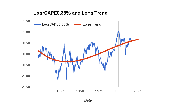
  • Some credence should be given to the possibility that CAPE has its own long-term trend. Predictions can be improve by filtering out this trend, at least partially.
"Corrected CAPE" is the term used here to designate a metric that applies all these ideas. To learn more, follow the links above.

A Safe Benefit

As of early 2016, the corrected CAPE is rather high, approximately +0.4. A corrected CAPE this much above a neutral value of zero implies over-valued stocks, hence a risk that future returns from stocks will be less than normal. Given this reading, how much weakness in stock prices might one expect? Is a swift decline likely, or an extended period of lackluster gains, or what? The answer, it turns out, depends on whether the goal is to predict changes for next year, the next decade, or even farther into the future.
Picture
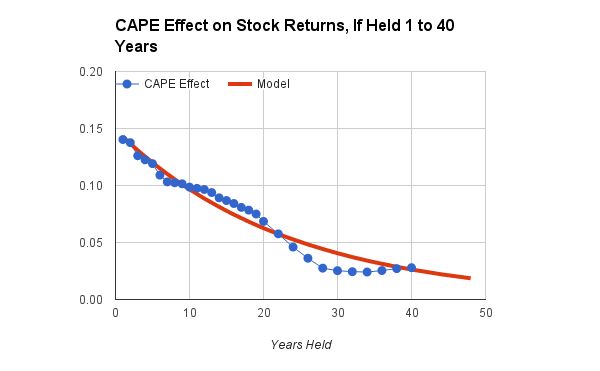
In the chart above, the CAPE Effect is a multiplier that tells how much to adjust the future returns of U.S. stocks, given a value of the corrected CAPE. The blue dots are actual data points from a comprehensive study covering the period from 1896 through 2015. The red line is a statistically fitted model used in our calculators.*

Given corrected CAPE's early 2016 value of +0.4, a one-year forecast is an effect of roughly 0.4 * 0.14 = 0.056 on a log scale. The spreadsheet function EXP(0.056) converts back to a percentage, 5.8%, which is the predicted reduction in real (inflation-adjusted) stock-returns over the next year, because of the current over-valuation. For the 1896-2015 period of the study, compound real returns were about 6.6% per year, so the year-ahead prediction is a return of 6.6% - 5.8%, or a meager 0.8% better than inflation, including reinvested dividends. With economists currently predicting an inflation rate of about 2%, the nominal return would be 2.8%. That's less than the historical return of ten-year Treasury bonds.

​If U.S. stocks were held longer, for the next 20 years, the chart predicts the effect would still be negative but less drastic, roughly half as large. The compound, inflation-adjusted return would be reduced about 2.6%. Instead of enjoying average real returns of 6.6% annually for two decades, one's portfolio of U.S. stocks would grow 6.5% - 2.6% = 4.0% per year, above inflation. That's not shabby. It's better than bonds, but below average for the long-term performance of stocks.

​What the chart says, in short, is that buying stocks today is like paying a premium price for a house when real-estate is hot. Even after holding the investment for many years, one's annualized profits may be tepid.

There's a problem, however, in making decisions like these. The next chart shows why. It presents the same data points (the blue dots), bracketed by their margins of error.** Statistically, most of the historical data falls between the upper and lower margins of error (the orange lines). A big gap between the lines implies great uncertainty; a narrow gap means the prediction is more trustworthy.
Picture
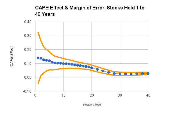
For stock investments held one year, the margin of error is extreme. While the average one-year effect might be alluring, actual one-year results have often been very different, in both directions. Evidently, a short-term forecast is both big and wild. It's like predicting tomorrow's weather to be a 90% chance of rain, maybe a steady downpour, maybe a brief drizzle.

At the other extreme, for a holding period of 30 to 40 years, the prediction is much more precise, thanks to a tiny margin of error. It's a safe forecast, but the effect has become small. Now the weather forecast is for a certainty of rain this season, totaling 5 to 6 inches, but there's no telling which days will be wet.

The ideal case would be to find the points on the chart where the range of uncertainty excludes a zero effect, which appears to happen after about three or four years, yet the effect-size remains large enough to matter, which seems possible up to the mid-twenties.

A Reasonable Time

Our calculators quantify these ideas by giving a weight to the corrected CAPE.*** As the margin of error decreases, the weight goes up. At the same time, as the effect-size declines, the weight goes down. The statistical model finds an optimal way to calculate the weights, and, it so happens, the weight steadily increases from one to 24 years, then very gradually declines.  

For a concrete example, start with the chart below. It shows how our calculators simulate the portfolio of a hypothetical investor who matches this description:
  • She has moderate preferences. Her goal is a compromise between maximizing gains and minimizing losses, and she is somewhat able to tolerate ups and downs in her investments.
  • She plans to start spending her savings in two years, when she will retire. Given her health status and current age, she expects to continue spending for a total of 25 years.
  • If she had children, she might add another five or ten years of spending, to allow her heirs to spend-down any residual savings after she dies. But she has no children and prefers to maximize her retirement budget by spending all her investments. Her home equity provides a safety net.
Picture
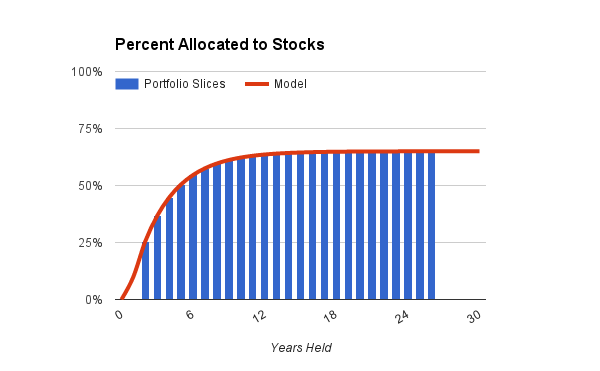
The calculator's statistical model, shown by the red line, sets the investor's exposure to stocks, given her preferences and the time remaining until invested funds will be spent.^ The blue bars are slices or portions of her portfolio, one for each year of anticipated spending.

Because this particular investor's preferences are moderate, the calculator assigns 65% as her maximum exposure to stocks, for investments held 20 years or longer. Anything not invested in stocks goes to bonds, at durations that depend on how soon the funds will be spent.

More than half the portfolio will be held 12 years or longer, and is therefor invested near the maximum level of 65% stocks and 35% bonds. The other half is invested with increasing caution, depending on proximity to the retirement date. As the investor ages and begins to spend her savings, the blue bars will, in effect, march to the left in the chart while staying under the model's red line, thus causing her portfolio to become more conservative over time. Right now, with retirement still two years away and many years of longevity on the horizon, her investments are, overall, about 60% in stocks.

That's without any adjustment for stocks being over- or under-valued. The next chart shows how much this investor's profile would have changed, when adjusted by the corrected CAPE, had the current date been any year between 1920 and 2015. Over those 96 years, 80% of the data fell between the lines shown as High CAPE and Low CAPE (10% were even higher, 10% even lower).
Picture
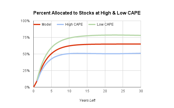
​As it happens, the corrected CAPE in early 2016 is approaching the value marked by the blue line, where High CAPE means that stocks are over-valued. In times like these, the hypothetical investor's profile gets shifted to the blue line, where the maximum invested in stocks is adjusted down to about 50%. On the other hand, if today's corrected CAPE were like the green line in the chart, with stocks a real bargain (Low CAPE), then more than 75% would be invested in stocks to be held for a decade or more. Notice, however, what happens for near-term holdings that will be spent in two or three years. Here, the calculator makes hardly any adjustment for CAPE.

If the holding period were extended well beyond 30 years, the adjustment would diminish somewhat because the effect of CAPE would very gradually fade. But it would not vanish completely in any normal lifetime. To give a specific example, if you had bought stocks near the top of the dot-com bubble in late 1999, when over-valuation of stocks peaked, your returns, even if you held the stocks for many decades, would likely be poorer than if you had purchased at a more normal price.

One final note is important. Some time in the next decade or two, stocks could take a tumble. If they do, the corrected CAPE may fall to a level that recommends a higher-than-normal exposure to stocks. If you adjust your stock allocation periodically, perhaps every quarter or year, according to the calculator's then-current recommendations, the result will be to move some of your holdings in and out of stocks as they become cheap or expensive, taking into account your evolving plans to spend your savings. In that sense, today's relatively expensive stocks are not a permanent penalty for your portfolio. They are a reason for caution that will last only until more optimism is warranted.

* The data for the study were monthly prices of the S&P 500, or a reasonable surrogate, and corresponding estimates of consumer inflation, from 1871 to 2015, as compiled by Robert Shiller. The period from 1871 to 1895 was used to initialize the values of the corrected CAPE. The plotted points in the chart are slopes from regressing LN(r) on LN(c), where r is the annualized real return on stocks, with dividends reinvested, and LN(c) is the corrected CAPE as described in an earlier post. The fitted line is a power function of the form s = -b * POWER( m, y ) where s is the slope; b and m are fitted constants; and y is the holding period in years.

** Statistically, the margin of error is the standard error of the least-squares estimated slope, on a natural-log scale.

*** The weight is k * s / e, where s is the slope; e, the standard error of the slope; and k, a fitted constant. All are on a natural-log scale. The weight is fitted to optimize the natural-log of the annualized real return.

^ The calculator's model for stock-allocations is an exponential function of the form:
p = q + u * ( 1 - EXP( - (y-1)/v) ),
where p is the portion allocated to stocks; q is a minimum allocation when there is one year left before spending starts; q + u is the upper limit or asymptote of the stock allocation; y is the holding period or "slice"; and v is a factor that controls the rate of rising from the minimum to the asymptote. As described here, this model worked better than other growth functions as a method of optimizing returns.

​
0 Comments

Are Stocks Expensive?

6/7/2016

0 Comments

 
Measured by CAPE, stocks in the U.S. seem expensive now. But CAPE has an historical bias. In the early 20th century, it drifted to consistently low values; in recent decades, to persistently high ones. These trends occurred whether the stock market was booming or busting. After removing CAPE's apparent bias, stocks in 2016 seem nearly normal. Which of these opposing views is more credible?
Picture

As noted in an earlier post, CAPE is a uniquely reliable predictor of future stock prices. It tends to correctly forecast the long-term direction, up or down, although it does better for the distant future than for next month or even the next year or two. A refined version of CAPE, called LogrCAPE0.33%, is shown below for the years from 1896 through 2015.* 
Picture
Right now, the computed value of this version of CAPE is above 0.5, as indicate by the last plotted value at the right end of the blue line. That's higher than the market peaks in 1929 and the late 1960's, which were excellent times to cut back on stock-ownership. However, the long-term trend of CAPE, plotted with the red line, suggests that CAPE was depressed in value throughout the early 20th century, then rose to higher levels in recent decades. A majority of the below-zero observations occurred before 1950, yet virtually every value since the late 1980's has been above zero. An extension of the trend-line suggests that CAPE may continue to have high relative values for another decade or more.

It's reasonable to ask whether CAPE would be a better predictor if its long trend were taken into consideration. Accordingly, the next chart adjusts the LogrCAPE0.33% metric by removing the trend.** The picture is more balanced, with values above and below zero occurring in every quarter-century. And the new trend-line is flat (a statistical necessity). Looking at recent values, the selloff in 2008 and early 2009 now looks like a good buying opportunity, with the de-trended CAPE hitting a low of -0.5. The current, near-normal value raises no alarm to avoid stocks.
Picture
One reason to be skeptical of the de-trended CAPE is that many other indicators say stocks are over-valued and are thus likely to weaken in the future. But what if all the indicators, including CAPE, share the same historical bias? Perhaps something about global economies or contemporary finance has changed fundamentally since late in the last century and will persist for decades to come. Maybe investors have more confidence in long-term payoffs from owning stocks because they see value in more global trade, or in better management of national economies, or in reduced fear of world wars and pandemics. Who knows? Lending credence to this speculation is a telling statistic. In a comprehensive analysis of U.S. markets since 1896 for periods of owning stocks from 1 to 40 years, the de-trended CAPE explained more variance (26%) in real returns than did LogrCAPE0.33% (20%).***

A rational person could take either side of the argument. Our calculators strike a compromise. They report value-adjusted allocations to stocks and bonds by first averaging LogrCAPE0.33% and the de-trended CAPE, then estimating allocations and returns from that average. Additional details about the statistical machinery of the calculators are posted here.

* For improved statistical results, the refined version computes a very long-term 0.33% exponential average of companies' earnings, instead of the classical 10-year ordinary average. It then takes the natural logarithm this ratio: current, inflation-adjusted prices divided by the exponentially averaged earnings. In a slight improvement on the standard method, the current month's price adds in the inflation-adjusted value of one month of dividends.

** The trend-line is a log-linear cubic polynomial. The de-trended CAPE is simply LogrCAPE0.33% minus the value predicted by the least square fit of the cubic model.

*** The to-be-predicted variable in the analysis was the actual, inflation-adjusted, compound annual return of U.S. stocks, with dividends reinvested. The returns were computed for all holding periods from one to 20 years, plus all even-numbered holding periods from 22 to 40 years, from January 1896 through December 2015. In a least-squares regression, the observed returns were predicted from a combination of CAPE and the holding period, using a function of the form r = b * c * POWER( m, y ) + a, where r is the log-real-return; c is the de-trended CAPE or LogrCAPE0.33%; a, b, and m are fitted constants; and y is the holding period.
0 Comments

A Better CAPE

6/1/2016

4 Comments

 
Shiller's CAPE is a sensible measure of whether U.S. stocks are over- or under-valued. But for statistical analysis, it has some weaknesses. Correcting them can improve the insights that CAPE may offer about future returns from stock investments.
Picture


​Background

Robert Shiller's CAPE is a well established, highly respected metric of the extent to which U.S. stocks are over- or under-valued, rooted in historical data that spans more than a century. Among its good points: CAPE is based on an idea which, on its face, makes a lot of sense. And it does a better job of predicting future stock prices than many other contenders (albeit, with some caveats). So, what's not to like?

First, consider the good points.

Essentially, CAPE compares a one-time snapshot to an historical trend. The snapshot is the price of stocks for large U.S. companies at a given time (the Standard and Poor's 500 or a reasonable surrogate). The trend is the average earnings of those companies for the preceding decade. Why use a 10-year average? Shiller's insight was that doing so smooths out the peaks and dips in earnings that companies experience during the normal boom and bust of economic cycles. Of course, over periods as long as a decade, inflation has to be considered, so CAPE adjusts all stock prices and earnings to express them in current dollars. In short, CAPE estimates whether, after making sensible adjustment for inflation, the current price of stocks is cheap or dear compared to companies' demonstrated ability to generate earnings. For a stock-buyer who wants to capture future earnings, it makes perfect sense.

​What's more, CAPE is a decent predictor, according to standard statistical tests. In Asset Management, Andrew Ang evaluated 14 possible predictors of future stock returns, over periods from 90 days to five years. CAPE was one of only two that gave statistically reliable predictions, and, of those two, only CAPE can be calculated contemporaneously. If you want to make a decent prediction, without waiting for future data, CAPE is the metric of choice.

Now, the weak points:
  • Balance. When calculated as a simple ratio and used in that form to conduct statistical analysis, CAPE is imbalanced. It gives too much weight to very high values (extreme over-valuation) and too little weight to very low ones (extreme under-valuation).
  • Persistence. Counting current earnings for exactly ten years, equally weighted throughout that period, is not optimal. The persistent effects of extreme conditions are better captured by averaging earnings in a different manner.
  • Trend. CAPE's message may be clouded by its own long-term trends. The CAPE value that is purportedly normal today may differ from what was normal decades ago.
​For each of these problems, fortunately, there is a plausible correction.

Balance

To see how CAPE over-weights high values and under-weights low ones, consider the chart below. It shows historical values of CAPE, from January 1896 to December 2015, assigned to bins in what statisticians call a "histogram."
Picture
Here, CAPE is computed in the classical manner. Real earnings (inflation-adjusted) are computed every month for 10 years, then averaged, with every month's value getting the same weight. Today's price of stocks (the S&P 500) is then divided by the averaged real earnings. It's denoted as PE10Y, or the ratio of P = price to E = earnings over a period of 10Y = ten years. The chart shows, for example, that there have been approximately 300 months since 1896 when PE10Y was between 12 and 16, and another 300, between 16 and 20.

The shape of the histogram is distorted because the ratio can get very large, as it did during the dot-com bubble around the year 2000, when PE10Y exceeded 40. But it can only get so small. It can never get smaller than zero, by definition. Statisticians call this distortion "skew," and in this case the amount of skew is +1.04, because of the long tail to the right and the bunched values to the left.

When a skewed indicator is used to compute correlations or to do a regression analysis, the values in the long tail get over-weighted, and the bunched values at the other end get under-weighted. For example, when real earnings are double the normal value, PE10Y goes up about 16 points, from 16 to 32, and weighs heavily in the calculation. But when real earnings are halved, PE10Y goes down only 8 points, from 16 to 8, and is weighted as if it were less extreme. Yet, to return to normal, the halved earnings would have to double. The needs-to-double value of PE10Y = 8 represents a state of affairs that ought to be weighted similarly to the case of already-doubled earnings at PE10 = 32.

Academic researchers correct this problem by taking logarithms. It's easy, however, to find articles in public media that fail to do so. The next chart shows one way to make this correction. It displays the same data, after first dividing PE10Y by its long-term median (middle value), then taking the natural logarithm. The result is denoted LogrPE10Y where "Logr" (pronounced "logger") stands for this mouthful of jargon: "natural logarithm of the median residual."
Picture
In this chart, the values are reasonably well balanced, although a slight elongation to the left has replaced PE10Y's extreme elongation to the right. Accordingly, the statistical skew for LogrPE10Y is -0.17, which is close to the ideal value of zero, though slightly negative. By using the median for the calculation, LogrPE10Y has exactly half its values below zero, and half above. Furthermore, a doubling of stock-prices would raise the metric from zero to about 0.7, while a halving would lower it by the same amount, to -0.7.

Notice that, in the chart for LogrPE10Y, halving of normal valuations has occurred a bit more often since 1896 than doubling of valuations. That's evident because the bars below -0.75 are somewhat higher than the ones above +0.75. From looking at the original, badly skewed chart for the ordinary PE10Y, you would never have seen that. In fact, you might have concluded just the opposite, because of PE10Y's long tail to the right. This observation is one way to appreciate the misleading nature CAPE's classical computation. 

Persistence

In PE10Y, today's price is compared to ten years of annualized, inflation-adjusted earnings, with the earnings estimated each month. Every month's estimate gets the same weight. But why should ten-year-old earnings get the same weight as current earnings, while those from eleven years ago get no weight at all?

​Shiller's original idea was that a decade-long average filters out the business cycle. While it may do so ordinarily, there are exceptions. For example, a period without a recession, but slightly longer than ten years, occurred from February 1991 to April 2001. Furthermore, the impact of earnings on stock-prices may be more than economic. There may be a behavioral component, as well. Investors' memory of extreme events like the bull market from 1982 to 2000 or the crash from 1929 to 1932 may influence their perception of stock-values. Would a twenty-year CAPE, for example, be a better filter of very long bull markets? Would an extended series of weights that decline ever so gradually for a very long time resemble investors' lingering memory of fearsome crashes?

The following chart addresses these questions by depicting three different ways to compute the average earnings in CAPE.
Picture
In the chart's blue line for PE10Y, the most recent 120 months all get a weight of 1/120 or 0.83%; every other month has zero weight. The red line for PE1% starts higher, with the current month getting a weight of 1%. Stepping backward in time, the weight gets reduced by 1% every month, simply by mutliplying the weight by 99%. After 240 months (2 years), the weight declines to about 0.1%. Over time, the monthly weight gets very, very small, but never exactly reaches zero. Finally, the orange line for PE0.3% starts quite low, with the first month weighted at 0.3%, which is less than half the weight that same month would get in PE10Y. The weight is multiplied by 99.7%, thus reducing it by 0.3%, marching ever backward into the past. Even 360 months into the past (30 years ago), the weight is close to 0.1%. Because of the curved, declining profile, the method used for PE1% and PE0.3% is typically called an "exponential average."

As it happens, after PE10Y and PE1% from 1896 to 2015 were subjected to the "logger" transformation (taking the logarithm of their respective median residuals), the resulting metrics were highly similar. Over the entire span of those 120 years, LogrPE10Y and LogrPE1% had virtually identical averages, medians, skew values, and standard deviations. They were also comparable at predicting future stock prices, as measured by explained variance.* You could, if you wish, use LogrPE10Y or LogrPE1% interchangeably.
Picture
However, LogrPE0.3%, the longer, more gradual exponential average, did even better. Among all exponential averages in a comprehensive analysis of predictions ranging from 1 to 40 years,** LogrPE0.3% was the overall winner. As summarized in the chart above, its skew was closest to zero, and it had the highest predictive power (explained the most variance). Compared to the ordinary 10-year period, CAPE was more informative when, in effect, it had a longer but diminishing "memory" for past events.

Trend

Since 1896, CAPE has not varied randomly. Over periods of 20 years or so, it has tended to hover at negative, neutral, or positive levels, not wandering freely across the full range of potential values. The chart below demonstrates the non-random behavior, using LogrPE0.3% for CAPE. The plotted line is a fitted (cubic) polynomial. If CAPE were truly random, the line would be flat or nearly so.
Picture
The trend shown in the chart poses some ambiguity about the proper interpretation of CAPE. For example, the dot-com peak in 2000 was double the size of any previous peak, when measured on raw values of LogrPE0.3%. However, when measured by the excess above trend, the extremity of 2000 was about the same as the 1929 peak. Making the interpretation even more difficult, the trend as of 2016 could look different when the fitted line is recomputed a decade or two in the future. If the fitted line were projected into the future, it would forecast a leveling-off, with today's CAPE becoming the "new normal." But, as Mark Twain famously observed, forecasting is hazardous, especially when you are trying to predict the future. It's just not clear whether current stock-prices are almost normal (compared to the trend line) or extremely over-valued  (assuming zero to be normal).

Speculatively, one might view the long trend as a behavioral indicator. Perhaps investors get accustomed to high or low stock-valuations, causing the "normal" level of CAPE to rise during long-term bull markets and to fall during periods of prolonged economic distress.

Whatever the reason, the long trend suggests why the explained variance, reported in an earlier chart, is low. It's just 20% because the statistical model made no adjustment for the long trend. Realistically, invoking CAPE to predict future stock-returns or to design a portfolio is a rough approximation. Using it is better than ignoring it. And, although LogrPE0.3% is a "better CAPE," it offers modest improvements, not guarantees.

Follow-up posts examine how the "better CAPE" can be used judiciously to fine-tune an investment portfolio and to adjust realistic expectations of future returns. In doing so, the follow-ups give a deep-dive into the merits of de-trending CAPE and the inner workings of our calculators.

* In data of the sort used here, with overlapping time-periods, traditional statistical tests may be biased. Ang's book, in chapter 8, section 5.2, explains why. Thus, the absolute level of explained variance (R-Squared) should be taken with caution. That said, different methods of measuring CAPE were all subject to the same biases. Comparing the explained variance of the methods is probably correct directionally, if not in magnitude.
​
** Two sets of regression analyses were performed. In both sets, real (inflation adjusted) stock-returns were predicted from CAPE values, using monthly data from January 1896 to December 2015. For exponential averages, PE10Y in December 1880 was the starting value. Annualized stock-returns, with dividends reinvested, were computed for all annual holding periods from one to 20 years, and for all biennial holding periods from 22 to 40 years. In one set of analyses (reported here), the regression slopes and intercepts were forced to be constant across all holding periods. In a second set (to be covered in a future post), the regression parameters were allowed to vary for each holding period.
4 Comments

Basic Portfolios

12/6/2015

0 Comments

 
The best and most popular news-posts at able2pay.com are being updated and moved. To see what's available, click on Retirement or on the Goals, Investing, or Portfolios menus at the top of this page. Included under Portfolios is an article on Basic Portfolios that amplifies the post immediately below.

Picture
Do you want  guidance on funds to buy in your 401(k), 403(b) or IRA, college-savings, or investment account? Here's an easy method from able2pay.com.
  • Answer two questions to set targets for stocks and bonds, suitable for your goals and preferences.
  • Allocate to three basic funds, which any firm will offer.

Step 1. Set a target percentage for stock funds.
When do you expect to spend most or all of the investments in this account?
  • All in the next year or two: Set final target = 0% and stop (skip the next question).
  • Most or all within five years: Set preliminary target = 30% and continue.
  • Six or more years from now: Set preliminary target = 60% and continue.
What is more important to you, maximizing gains or minimizing losses?
  • Maximize gains: Add 15% to your target.
  • Minimize losses: Subtract 15% from your target.
  • Do both: Keep your preliminary target (no change).
You now have a target of 0%, 15%, 30%, 45%, 60% or 75%. This is the amount you will allocate to stock funds. The rest will go to bond funds. (If you want more finely tuned values, you can get them with our Best-Invest calculator.)

Step 2. Allocate to suitable stock and bond funds.
Use your target to find the matching row in the table below. Then use the percentages in your row to invest in the funds shown by the column headings. Most 401(k), 403(b), IRA, college-savings, and investment accounts will offer these funds or equivalents. Below the table are descriptions that will help you find the right ones for your account.

Target US Stocks International Stocks Intermediate Bonds Short-Term Bonds
75 % 50 % 25 % 25 % 0 %
60 % 40 % 20 % 40 % 0 %
45 % 30 % 15 % 55 % 0 %
30 % 30 % 0 % 40 % 30 %
15 % 15 % 0 % 25 % 60 %
0 % 0 % 0 % 0 % 100 %
  • U.S. Stocks: Use an index fund that invests in the total U.S. stock market. If not available, use an index fund of large-cap U.S. stocks or the S&P 500. Avoid anything that's not indexed or that's more specific.
  • International Stocks: Use an index fund that invests in all non-U.S. stock markets. If not available, use an index fund of EAFE stocks (developed countries outside the U.S.). Avoid anything that's not indexed or that's more specific.
  • Intermediate Bonds: Use a bond fund that invests primarily in a broad mix of U.S. treasury and corporate bonds. Avoid funds with a limited focus on TIPS or on inflation-linked, international, high-yield, or short-term bonds. In a 401(k), 403(b), or IRA account, you should also avoid municipal bonds.
  • Short-Term Bonds: Use a fund of U.S. treasury bonds with maturities less than five years. If not available, use instead a short-term bond index fund or a money-market fund.

Optional Step for IRA and Taxable Accounts
The following options are good improvements for an IRA or taxable account, but are unlikely to be available for your 401(k), 403(b), or college-savings plan:
  • Invest at Betterment, and simply use the target from Step 1. Betterment's automated service will invest in a well-designed set of U.S. and international stocks and bonds.
  • Invest  at Vanguard, using the alternate table below and these funds: Global Minimum Volatility; either Mid-Cap Value Index or Strategic Equity; Intermediate-Term Bond Index; and Short-Term Treasury.
  • Invest in a low-fee brokerage account such as Fidelity or TD Ameritrade, using the alternate table below and these Exchange-Traded Funds (ETFs): iShares MSCI All-Country World Minimum Volatility (ACWV), Vanguard Mid-Cap Value (VOE) or equivalent; Vanguard Intermediate-Term Bond (BIV) or equivalent; Vanguard Short-Term Government Bond (VGSH) or equivalent.
To learn more about global low-volatility stocks, mid-to-small value-stocks, and Betterment's portfolio, see the article Diversify! on the Portfolios menu.
Target Global Low Volatility Mid & Small Value Intermediate Bonds Short-Term Treasury
75 % 50 % 25 % 25 % 0 %
60 % 40 % 20 % 40 % 0 %
45 % 30 % 15 % 55 % 0 %
30 % 30 % 0 % 40 % 30 %
15 % 15 % 0 % 25 % 60 %
0 % 0 % 0 % 0 % 100 %
0 Comments

Your Portfolio: Near-Term Inflation

9/16/2015

 
This post was part of a series on building a portfolio of mutual funds or Exchange Traded Funds. Much of the series has been moved to articles on the Portfolios menu:
  • Basic Portfolios: Some simple ideas that work remarkably well.
  • Diversify: Effective ways to diversify with bonds and stocks, globally.
  • Factor Investing: Specialized portfolios that employ techniques from academic research.
  • Respond to Inflation: Realistic options for inflation-protection, near-term and long-term. (Not yet moved, this topic is covered below, in this post.

On the topic of inflation, Andrew Ang's fine textbook, Asset Management, offers many good insights, to which I am much indebted (see his chapter 11). I've superimposed my own analysis, however, and sometimes relied on additional sources.

Overview

It's helpful, I think, to focus on inflation with three sets of questions:
  • Near-term: At a given time and for the next year or two, how should an investor's portfolio adapt to inflation or, equally important, to deflation? This question matters if, and only if, you plan to spend some of your investments in the next year or two.
  • Long-term: What investments, if held a long time, will best protect against inflation? Do the same investments protect against deflation? And how long is long enough?
  • Correlates: Both near-term and long-term, what investments (if any) are correlated with inflation (or deflation)? If one applies diversification criteria, do any of the popular candidates, such as TIPS, commodities, and real estate, truly add value?
An important conclusion will be that sensible protection against inflation and deflation is possible, but by different methods for the near-term than for the long-term. Furthermore, the popular candidates may not be the best or the only methods you should consider.

Near-Term

Here's an interesting test. You come to me in December, asking "What will inflation be next year?" I caution that nobody knows the perfect answer, but one indicator is quite good and amazingly simple. "It has correlated 0.64 with next year's inflation for the past 100 years," I proclaim. Then I show you data for the past century, using the chart below. Can you guess what my indicator is?
Picture
No, it's not the price of oil or gold. It's not the return on inflation-indexed bonds, or the median price of homes, or any exotic financial product. And it's a lot simpler than the economic model favored by this year's hot economist. It's last year's inflation. Yup. Next year's inflation is pretty well predicted by inflation over the most recent 12 months. That's because inflation (or lack of it) tends to persist. *

Despite the dire tone of some articles and commentary, inflation is not like a thief in the night who steals your heirloom jewelry, sets your home ablaze, and swiftly vanishes before dawn, leaving your wealth devastated. He's more like the unwelcome guest, your financially reckless cousin, who emails you one day and shows up on your couch the next, feasts from your pantry, maxes all your credit accounts, totals your car, and requires strenuous measures to be evicted, leaving you poor, thin, weary, and forgiveably ungracious after a prolonged ordeal.

The point is that you'll know when inflation is becoming a problem. One of the more obvious clues will be that interest rates are rising. That clue, as it happens, also defines your best defense.

T-Bills
As Ang and others before him have pointed out, the asset most strongly correlated with inflation and the best single hedge against it is a 3-month Treasury Bill. As inflation rises or falls, the interest rate on T-Bills tends to follow. Because T-Bills can be redeemed and reinvested at the newest rate every three months, the response to inflation, although lagging somewhat, is timely. 

Even so, it's not a perfect hedge, mainly because policies of the Federal Reserve sometimes (not always!) hold T-Bill rates below the inflation rate. That happened for nearly two decades during the Great Depression and World War II, and again, more recently, for six years and still counting since the financial panic of 2008-2009.

These limitations notwithstanding, a T-Bill offers good protection against inflation for expenses you know you will have to pay within the next year or so. Here's a concrete example:
  • A hypothetical saver needs $1000 per month to pay expenses that are not covered by her other sources of income, such as work, Social Security, or an annuity.
  • In late December, she has $3000 in a bank account (earning next to nothing) to cover her expenses through March. She withdraws $12,000 from her investment or retirement account, and buys a 3-month T-Bill. (She can do so easily and with no fees whatsoever at www.treasurydirect.gov.)
  • In April, she redeems the T-Bill and puts enough in her bank account to cover the next three months' expenses. If her expenses have risen (or fallen) a bit in the past three months, she sensibly increases (or decreases) the amount set aside in her bank account, thus maintaining a smooth standard of living. (To simulate these adjustments, I exactly matched them to the change in consumer prices, up or down, for the previous quarter.) The remainder gets reinvested in a new 3-month T-Bill.
  • She does the same in July and October.
  • At the end of December, she looks at the amount she will get by redeeming the most recent T-Bill, to see if it will cover the first three months of the coming year. She wants it to cover her real expenses, which may have risen above $1000 per month because of inflation over the past year.
Had this strategy been followed every year from 1934 to 2014, the results would have been as shown in the chart below. The value depicted in the chart is the surplus (or deficit) over the amount needed for the first quarter of the coming year, adjusted for inflation.
Picture
Before 1952, when interest rates were restrained by the federal government, the results were weak. On average, the amount available after a year was nearly 9% less than the amount needed for the next three months. These were desperate times, financially, and it is not clear that any one-year savings plan could have done better.

From 1952 through 2014, the results were good. On average, there was a real 1% surplus, and surpluses occurred much more often than deficits. On the assumption that future federal policies may resemble those enforced since the early 1950's, the T-Bill strategy looks attractive.

Short-Term Treasuries
What if you were willing to take a bit of a chance on longer-term bonds? For example, how about a short-term Treasury fund whose bonds have average maturities around 2 years? One might expect such a fund to respond to inflation less quickly than T-Bills, but to pay a higher rate of interest and to be penalized somewhat less when federal policies suppress the interest on T-Bills. The next chart shows the results from using 2-year Treasuries instead of 3-month T-Bills.
Picture
Clearly, there is much more variation from year to year, which is not good for budgeting. On the other hand, the average surplus for the period 1952-2014 was higher, around 2%. In several years, the surplus was a full month's expenses. Here's an idea: What if the surpluses were carried over, to offset subsequent deficits?

A variant of that idea turns out to be highly effective, perhaps the best strategy of all. It works like this:
  • In the first year, save two years' expenses ($24,000 for our hypothetical saver) instead of one ($12,000).
  • Use a fund of 2-year Treasuries instead of T-Bills.
  • Don't spend any surplus. Don't try to replenish any deficit. Simply add next year's expenses at the end of each year, adjusted according to the past year's inflation, exactly as in the T-Bill strategy.
The extra deposit at the outset serves as a cushion, creating, in effect, a reserve fund.
Picture
This strategy accumulates unspent surpluses over time, even in difficult periods. The chart above illustrates how the strategy would have worked in three very different 26-year periods. The first period, 1934-1959, saw a toxic mix of occasional high inflation, recessions with steep deflation, and persistent suppression of Treasury rates. During this time, the strategy lost some of its reserves but never went to ground. Bear in mind that the values in the chart are real dollars (inflation adjusted). Thus, the $3000 of buying power that remained on reserve at the end of 1959 would have seemed much larger in nominal dollars. The second period, 1961-1986, spanned multiple recessions and successive years of high inflation. Yet it maintained good reserves throughout. The final period, 1988-2013, benefited from a bull market in Treasuries and ended with enough surplus to cover more than two years of inflation-adjusted expenses.

Short-Term TIPS
Originally, they were called Treasury Inflation-Protected Securities, or TIPS. But they never truly guaranteed protection from inflation, and the Treasury Department now calls them Treasury Inflation Indexed Notes or TIINs, if their maturity is five years. The new name is apt because in recent times, their value as an inflation hedge has been about as good as, well, TIIN.

Surprised? Consider this example. In October 2010, you could have bought TIPS from the Treasury Department that would mature four years and eight months later, in April 2015. Those TIPS would have paid a measly interest rate of 0.5%, which would have seemed reasonable because T-Bills paid even less. At the time, the big institutions that bid at Treasury auctions expected inflation to start rising. So they bid up the price of the TIPS, thereby forcing buyers to pay, on average, $1055 for a bond that could be redeemed in nearly five years for $1000 plus inflation. They were counting on inflation to recoup the extra $55 and then some. As it all worked out, the cumulative inflation between October 2010 and April 2015 was 8.2% (equivalent to 1.7% per year). The buyer was therefore paid about $1082 in April 2015, plus those flimsy interest payments twice a year. For the initial investment of $1055, the buyer got a real (inflation adjusted) total return of about 1% per year. The five-year bet on inflation paid off, in this case.

But what if the original buyers' expectations were wrong? It can happen. In July 2014, no one anticipated that inflation for the next 12 months would be virtually zero, but that's what it was (0.2%). If you had bid on TIPS in early 2014 expecting a 1% real return, you would be holding a loss after the first year. Because mutual funds and ETFs buy, sell, and redeem TIPS continuously, they are vulnerable to such miscalculations. They can lose money when their inflation bets are too high. 

For some evidence, consider the chart below. It shows the real (inflation-adjusted) returns since late 2009 for two funds: STPZ, the PIMCO ETF for short-term TIPS; and VSGBX, a Vanguard fund for short-term bonds from the Treasury Department and other federal agencies. The PIMCO fund holds TIPS exclusively; the Vanguard fund holds no TIPS at all. Over the six-year period, both funds virtually matched inflation, with a terminal value near $1.00 for every dollar originally invested. But the TIPS fund was more volatile, rising or falling as its inflation bets came out winners or losers.
Picture
It would be nice to know if the long-term trend will resemble the short history shown in this chart. Alas, six years is the longest history available for a short-term TIPS fund as of September 2015. Pending additional evidence, a rational investor could use a short-term TIPS fund, instead of short-term Treasuries, but the outcome might not be any better, and the ride may be less smooth. An educated guess is that short-term TIPS may do better when inflation is rising, while short-term Treasuries might excel when deflation and recession are lurking.

Lessons

Academic studies and historical data imply that near-term protection against inflation (and deflation) can be secured by either of these strategies:
  • Hold a year's worth of anticipated expenses in 3-month T-Bills, redeeming and re-investing every three months. Virtually as good, use a savings or money-market fund if it is safe, very liquid, and pays interest at or above the rate of T-Bills.
  • Or, hold two years of anticipated expenses in a fund of short-term U.S. government bonds. Withdraw expenses for a year, and replenish with anticipated expenses for the next year, keeping any surplus on reserve. A fund of short-term TIPS may be reasonable, but other U.S. government bonds are likely to offer more consistent performance.
In the next and final post in this series, we'll look at long-run inflation and the best strategies to mitigate its effects on your portfolio.

* In the chart, an outlier that goes against the trend is the solitary point in the lower right quadrant. It's for 1921 when, after World War I brought inflation that exceeded 15% annually, the economy sank sharply into recession. Within the year, high inflation switched to extreme deflation. It's the only such whipsaw in the past century. In fact, it's an exception that proves the rule because the preceding inflationary trend persisted for four years, and the subsequent deflation lasted for two, followed by several years of low inflation and the booming economy of the Roaring Twenties.

Disclaimer: Historical data cannot guarantee future results. Although a mixture of bonds and stocks may be safer than investing exclusively in one class of assets, diversification cannot guarantee a positive return. Losses are always possible with any investment strategy. Nothing here is intended as an endorsement, offer, or solicitation for any particular investment, security, or type of insurance.

Your Portfolio: Diversified Bonds

9/1/2015

 
This post is part of a series on building a portfolio of mutual funds or Exchange Traded Funds. The topics of the series, listed below, have been expanded into a downloadable handbook at Enable!, our online bookstore. The download includes new content on account types, sample portfolios, technical methods, and more.
  • Start with Basics: Some simple ideas that work remarkably well.
  • Diversify Smartly: Effective ways to diversify with bonds and stocks, globally.
  • Focus on Factors: Specialized portfolios that employ techniques from academic research.
  • Respond to Inflation: Realistic options for inflation-protection, near-term and long-term.
Bonds may seem simple. But they aren’t. To explain how they might diversify a portfolio, I’ll start with a common-sense overview, then give some basic recommendations for U.S. bonds. After that, if you want details and justifications, you can optionally read to the end of this post. International bonds are covered in a separate post.

Why Bonds Are Hard

You buy bonds, they pay interest until they mature, then you get your original deposit back. Almost like CDs, right?

Well, not exactly. With bonds, the price goes up or down as the prevailing interest rates go down or up. It’s backwards. Rising interest rates mean falling values for the bonds in your portfolio, and vice versa.

Plus this. With bonds, unlike CDs, you have to worry whether the bond-issuer will default, stop paying the interest you are due, and maybe return less than your original purchase amount. Treasury bonds, issued by the U.S. government, are the least likely to default, hence the safest. Corporate bonds have a higher risk of default, particularly from low-rated companies.

Foreign bonds, anyone? If they are issued by, say, the United Kingdom or Japan, the risk of default is probably very low. But there’s a catch. You have to buy the bonds in British pounds or Japanese yen and convert the interest-payments to dollars.  You have become a currency gambler.

Then there’s inflation. If it goes up (or down), interest rates will tend to rise (or fall), but not immediately, and your bond values go the other way (eventually). What’s more, there’s presumed inflation, the rise or fall that bond-investors expect to occur. This expectation affects bond-prices, too. And guess what? The expectations may be wrong (because inflation is hard to predict). Even if the expectation is right, and inflation perks up as forecasted, long-term interest rates are likely to respond later and less than short-term ones. All of which makes bond-pricing and inflation-watching a real puzzler.

Try to figure this one out: You thought inflation rates would rise, followed in a few months by rising interest rates, after which the U.S. economy would slow down to what economists once called a “soft landing,” and a mild recession would then grip the globe. As events unfolded, interest rates did rise, but inflation failed to follow, and every economy worldwide tanked more than forecasted, causing some indebted companies and weak governments to default. What happened to your bond portfolio?

Give up? Some investment firms do essentially that, opting for the easy recommendation to buy a portfolio that covers the “total bond market.” Examples: VBMFX plus VTIBX from Vanguard; or AGG plus IGOV from iShares; or ETF combinations weighted to mimic the world’s bond markets, as done at Betterment, Schwab, and others. (Actually, these are “near-total” funds as they rightly exclude junk-bonds from low-rated companies and tax-advantaged bonds from city and state government.)

Basic Recommendations

The following recommendations are based on academic research as reviewed in a fine textbook by Andrew Ang, and on my own detailed analysis of U.S. Treasury and corporate bonds from 1953 to 2015. This historical period had three very different, 20-year phases. The first saw rising interest rates; the second had high inflation coupled with rates that rose then started to fall; and the last enjoyed steadily falling rates. Beware of advice based exclusively on any newer, shorter time period. Most questionable are recommendations from data that starts after 1982. That's an exuberant period of falling interest rates, rising bond prices, and low inflation overall, which was biased in favor of bonds.

My analysis of the longer period from 1953 to 2015 suggests that three bond funds can diversify your stock investments. At any given time, one or two of them will suffice, depending on your circumstances.
  • Long -Term U.S. Government. The fund should invest in bonds from the U.S. Treasury and other federal agencies, with average maturities longer than 10 years, preferably near 20. Examples: VUSTX or VGLT from Vanguard, or TLH or TLT from iShares. 
  • Long-Term Corporate. The fund should hold 10-to-30 year bonds issued by well-rated (investment-grade) U.S. companies. Examples: VWESX or VCLT from Vanguard, or LQD from i-Shares.
  • Short-Term U.S. Government. In this fund you should find Treasuries and bonds from other federal agencies, with average maturities of 2 to 3 years. Examples: VSGBX, VGSH, or VFISX from Vanguard, or SHV from iShares.
(In a taxable account, you should consult your tax-adviser about using a short-term or long-term municipal bond fund, perhaps for your state, instead of the funds listed above.)

To determine which fund to use, if you plan to hold your investments for five years or longer, consult the table below. For example, when Able to Pay's calculator (or some other method) says you should invest 70% in stocks, then the table advises you to put the remaining 30% in long-term government bonds. But if your stock-allocation is below 40%, the table assigns the rest to long-term corporates. The 40% threshold is not absolute. You could reasonably use an even split of long-term government and corporate bonds for stock-allocations near 40%.

Holding Periods Longer Than 5 Years
Stocks 20 Year Governments 20 Year Corporates
90% 10% --
80% 20% --
70% 30% --
60% 40% --
50% 50% --
40% 60% --
30% -- 70%
20% -- 80%
10% -- 90%

For holding periods of one to five years, two changes should occur. Your stock-allocation should decrease, to reduce the risk of loss. Concurrently, your bond-holdings should shift toward short-term government issues, both to control losses and to respond, if necessary, to inflation.

The next table lays out guidelines for a forward-looking, middle-of-the-road investor, one who aims both to achieve some gains and to limit possible losses, and who plans to spend 100% of her savings one to five years from now. Consistent with the preceding table, long-term bonds are allocated to corporates if the overall stock-allocation is under 40%; otherwise, the long-term portion goes to government-issued bonds. One could do about equally well by putting bonds in an intermediate-term index, such as a "total bond market" fund, when the stock percentage is below 40% and the holding period is five years or less.

Example for Holding Periods from 1 to 5 Years
Years Left Stocks 20 Year Bonds 2-3 Year Bonds
5 51% 39% (Government) 10% (Government)
4 46% 35% (Government) 19% (Government)
3 37% 33% ( Corporate ) 30% (Government)
2 26% 31% ( Corporate ) 43% (Government)
1 10% 30% ( Corporate ) 60% (Government)

For values fine-tuned to your preferences and circumstances, use Able to Pay’s calculators, which take into account two aspects of your holding period: when you will start spending, and how many years you will continue spending. The best allocations for you may be different from the tables above if your spending starts farther in the future or lasts more than five years. And bear in mind that any funds you need to spend within 12 months (a zero-year holding period) should be kept in bank savings, T-Bills, or a money-market fund.

These are the basic recommendations. To get the full details, read on!

Whether to Diversify

To develop recommendations for corporate and long-term bonds, I began by asking whether various bonds could beneficially diversify a portfolio that already held U.S. stocks. This analysis entailed a new concept, investment factors. Where macro-factors apply to big forces that affect an entire economy or many markets, an investment factor is more narrow. It affects the investments in a particular market.

Academic research has identified several investment factors affecting bonds. The two most important, for our purposes, are term structure and credit risk.
  • Term refers to the number of years a bond pays interest (its years to maturity). Short-term bonds have maturities less than 5 years; intermediate-term bonds, 5-10 years; long-term bonds, 10-30 years. As Ang’s book explains (chapter 9, section 3.3), the interest rates of short-term bonds are heavily influenced (about 70%) by inflation; they are much less influenced by economic growth, monetary policies, and other macro-factors. For long-term bonds, the opposite holds true. They are weakly influenced by inflation (32%) and strongly influenced by other factors. The influences on intermediate-term bonds are much like those for long-term bonds. It may be promising, therefore, to diversify between short-term and long-term bonds, omitting or de-emphasizing the intermediate term.
  • Credit refers to the risk of default. Will the issuer of the bond make good on the promise to pay dividends and to return all the principal (the face value) when the bond matures? With U.S. Treasuries, the risk of default is extremely low, and is often assumed to be zero. In contrast, bonds issued by corporations (and government agencies other than the U.S. Treasury) have some risk of default. Investors who held bonds from General Motors in 2009, for example, or from the City of Detroit a few years later, faced the very real risk of not being repaid the full amount they had invested. Credit risk can be mitigated by buying bonds from many issuers, just as the risk of bankruptcy can be mitigated for stocks by purchasing shares in many companies. Because corporate bonds have credit risk and U.S. Treasuries do not, diversifying across the pair of them may be advantageous.
Taking guidance from the investment factors of term and credit, let’s apply the diversification criteria to short-, intermediate-, and long-term Treasuries and corporates.
  • Are they objectively different? When contrasted with stocks, corporate bonds depend on the financial health of the companies, as stocks do. Treasuries don’t. They depend, instead, on the good faith and credit of the U.S. government. Thus, Treasuries should get more weight as diversifiers, because they differ from stocks to a greater extent than corporate bonds do. Among bonds, the biggest differences are between short-term Treasuries and long-term corporates, as they differ on both factors. Perhaps these two will diversify each other, while they also diversify stocks.
  • Are there new risks? Technically, the credit risk of a company’s bonds is somewhat less than the risk of loss from investing in the same company’s stock. Why? Because if the company fails, bond-holders may partially recoup their investments, while stock-holders lose everything. Because of this, and because the default-risk of U.S. Treasuries is extremely low, the incremental risk of adding any bonds to a portfolio is minimal. That’s good for diversification! (A caveat: Low-rated bonds, which have high credit-risk, may add little value.)
  • Are the returns equal or better? No. In general, the returns on bonds are less than on stocks. However, long-term bonds come closest to the compound return of stocks, thus arguing for them as the best of a set of tepid choices.
  • What’s the correlation? Historically, the correlation between Treasuries and stocks has tended to be zero or somewhat negative, making Treasuries attractive diversifiers for a stock-portfolio. Corporate bonds tend to have low positive correlations with stocks, low enough to make them candidates for diversification, but less compelling than Treasuries.
Clearly, no single type of bond scores highly on all the diversification criteria. A mix of Treasuries and corporates looks promising, because it would diversify across the credit factor, but the mix must also diversify across term. To find a good mix, I analyzed portfolios ranging from 10% to 90% in S&P 500 stocks, and the remainder in a single type of bonds. I did so for data from 1953 to mid-2015, for each of the following: 
  • 2 Year Treasuries (short-term)
  • 5 Year Treasuries (intermediate-term)
  • 10 Year Treasuries (intermediate-term)
  • 20 Year Treasuries (long-term)
  • 20-30 Year A-Rated Corporates (long-term, with favorable credit-risk)
  • Simulated Intermediate-Term Index*
Picture
The chart above shows the results, applying the same investment goals used earlier in this series. For building real wealth and keeping pace with inflation, long-term bonds, both Treasuries and corporates, best diversified a portfolio that already had stocks. They generated the biggest portfolio returns. For limiting downside volatility, however, 2-year Treasuries were the best addition, because they had the smallest portfolio losses. In comparison, intermediate 5- and 10-year Treasuries and a simulated intermediate-term index were middling, neither best nor worst.

This finding poses a dilemma. Is it possible to add both long-term bonds and short-term Treasuries without nullifying their respective benefits? Or does one cancel the other, making the combination no more effective than simply using intermediate-term bonds, perhaps chosen broadly to represent the entire bond market? The solution to the dilemma turns on your goals as an investor.

How to Diversify

Long-Run Goals
Continuing with the same broad goals used earlier in this series, let’s first consider investments you plan to hold longer than five years. For these, your weights would be:
  • Grow wealth: High
  • Protect buying power: High
  • Avoid losses, near-term: Low
With many years left before you spend your investments, you could ride out near-term losses, provided that your portfolio’s long-term trend was to grow faster than inflation and also, if possible, faster than the economy. In this case, your portfolio should have 40% to 90% invested in stocks, by our models, with the specific percentage depending on your spending plans and tolerance for market swings. The rest of your portfolio should be in long-term government-issues, because they exhibit no correlation with stocks, historically, and their low risk of default differentiates them from economically vulnerable corporate securities.
Picture
The evidence is in the chart above. It is like the previous chart, but limited to portfolios with 40% or more invested in stocks.** In the top two panels, which correspond to the high-weighted goals, notice the bump-out for 20-year Treasuries. Even for the lower-weighted goal of limiting near-term losses, in the bottom panel, 20-year Treasuries did virtually as well as most other bonds, for these long-run portfolios.

The advantage of 20-year Treasuries was consistent. They ranked first or a very close second at all stock-allocation levels from 40% to 90%. That said, they were not necessarily tops in any given year, and the paths taken through particular 20-year periods were variable.

What if you prefer to invest less in stocks for the long run than our models recommend? In that case, at stock allocations from 10% to 30%, long-term corporates would have been your best diversifier, historically. This makes sense intuitively because a smaller allocation to economically sensitive stocks encourages a modest exposure to the credit risk of corporate bonds. The next chart has the evidence. Now the bump-out in the top two panels is for long-term corporates.
Picture
Near-Term Goals
Bear in mind that the foregoing results are for holding stocks and long-term bonds for many years. What if you hold them for shorter periods? Then your goals are different, something like this:
  • Grow wealth: Low
  • Protect buying power: High
  • Avoid losses, near-term: High
As implemented in our calculators, if you plan to spend your investments over the next one to five years, a portion of your portfolio gets transferred from stocks to bonds. The transfer goes increasingly to safer, short-term government bonds as you get closer to the year when you will start spending. But they don't go there completely. Some bonds remain in longer-term securities. Should those be long-term corporates, as argued above, or something more cautious?

The next chart answers the question with two good options. It displays average results over all of the 20 unique combinations generated by our calculators where the holding period is five years or less and the recommended allocation to stocks is under 40%.
Picture
Yes, keeping the remainder in long-term corporates is a good option. Virtually as good, however, is assigning the rest to a fund that indexes intermediate-term corporate and government bonds (“total bond market” funds, for example). The real return is slightly worse with the intermediate option, but the risk of loss compensates with a marginally better reading, and this is the more important goal. All in all, both choices work well.

Examples

Long-Run Example
Recall that the historical data covered three 20-year periods during which bonds performed very differently. Using the previous example of a long-run portfolio with 66% in stocks (the S&P 500), the following chart illustrates what happened in each period when the the remaining 34% went to long-term Treasuries. The journeys were disparate, but the outcomes, very similar.
Picture
Near-Term Example
Previously, when looking at basic portfolios, we examined non-overlapping, three-year holding periods for investments cautiously allocated 25% to S&P 500 stocks, 20% to 10-year Treasuries, and 55% to 2-year Treasuries. Let's take a fresh look at those periods, with these updates:
  • Long-term corporates replace 10-year Treasuries.
  • The investor, using Able to Pay's calculators in the intended manner, updates allocations annually as the years ramp down from three remaining to two and then to one. By the final year, the allocations are 10% S&P 500 stocks, 10% long-term corporates, and 80% 2-year Treasuries.
  • Instead of periodic rebalancing, the portfolio is simply set to its new allocations at the end of each year.
The outcomes, shown in the chart below, are somewhat more consistent (less dispersed at the end), and the losses are smaller in the two worst cases, 1972-1974 and 1978-1980. An apt way to summarize the pattern is that for an investor whose goal is to minimize losses, this ramp-down strategy for bond-allocations resulted in a low 10% chance of losing 10% in buying power over three years. (And nominal dollars, not adjusted for inflation, exhibited no loss at all in any of these time periods.)
Picture

* The Simulated Intermediate-Term Index was a weighted average of 10% 2-year Treasuries, 50% 10-year Treasuries, and 40% 20-30 year corporates. This value had virtually the same compound return and standard deviation as Vanguard's Intermediate Bond Index fund since it was initiated in 1994. 
** While 40% was chosen as a threshold because of Able to Pay’s model for long-run portfolios (held five years or longer), it was optimal by another criterion, as well. In a linear regression seeking to optimize returns, 40% was the point above which 20-year government bonds emerged as the best long-term diversifiers. Below 40%, long-term corporates were better.

Data sources: Shiller for S&P500, 10-Year Treasuries, and CPI inflation. FRED for 2-year, 5-year, and 20-year Treasuries, and A-rated long-term corporates; some missing data-points were interpolated with regression models. BEA for real GDP annually in the U.S. For those interested in technical details, a forthcoming article to be published at this site will explain how the measurements here were constructed and compare them to other possible methods of analysis.

Disclaimer: Historical data cannot guarantee future results. Although a mixture of bonds and stocks may be safer than investing exclusively in one class of assets, diversification cannot guarantee a positive return. Losses are always possible with any investment strategy. Nothing here is intended as an endorsement, offer, or solicitation for any particular investment, security, or type of insurance.

(in)(de)(no)flation: Mixing It Up, For Later

4/10/2015

 
This post is the fifth and last in a series about investing to protect against changes, up or down, in consumer prices. Previous posts argued that historically:
  • Stocks have offered the best protection against inflation over the very long term (18+ years), 
  • In the short term (0-5 years), investing exclusively in one type of bond fund may be ill-advised. Instead, a mix of short-term corporate and treasury bonds plus short-term TIPS may be prudent.
  • Over a holding periods from 1 to 20 years, intermediate-term Treasuries are paradoxical. They offer better average returns but a greater risk of lost purchasing power, compared to short-term Treasuries.
  • Adding a small allocation to stocks may create a portfolio well suited for 1-year to 5-year investments, having compound returns like intermediate-term bonds and price-protection like very short-term bonds.
In this post, I investigate how increasing your portfolio's allocation to stocks may generate sensible strategies for longer-term investing of 5 to 20 years.

Testing a Longer-Term Portfolio

The portfolios in this analysis are based on the data described in a previous post. There I considered a mix of 10% U.S. stocks, 20% intermediate-term Treasuries, and 70% short-term TIPs and bonds, which historically has had compound returns like intermediate-term Treasuries and price-protection like diversified short-term bonds. As an investment strategy, this mix looked attractive for short time-horizons, perhaps 1-5 years. As a point of comparison for longer periods, I flipped the percentages of stocks and short-term bonds, creating this portfolio:
  • 70% U.S. stocks
  • 20% 10-year Treasuries
  • 10% 2-year Treasuries
The chart below shows how, from 1920 to 2014, this portfolio compared to one invested entirely in stocks and to the portfolios reported earlier in this series. All the portfolios were rebalanced quarterly, if more than 3% out-of-balance, using methods explained here.
Picture
If you had invested in 1920, totally ignored all the exciting and disturbing events that transpired for the next 94 years, and cashed out in mid-2014, putting all your money on stocks would have been the best strategy. If, on the other hand, you were not able to anesthetize yourself against churning markets and had less than 94 years of patience, would the portfolio with 70% in stocks have been better? In the chart above, the answer is not obvious. Yes, there was somewhat less churn, but it was still a bumpy ride.

Suppose, instead, that your time-horizon is 17 years. Perhaps you are investing a lump-sum toward the future college education of a newly born grandchild. Or you are investing this year's 401(k) contribution, with a plan to purchase a life-time fixed annuity when you retire 17 years from now. (As a retirement strategy, this may be a sensible plan in some limited cases, if your overall savings are low.)

If you had invested for 17 years starting in 1928, your results would have been as shown in the next chart, which has the same set of portfolios. This particular period had deflation in the early 1930's, inflation during the 1940's, and a severe economic downturn during the Great Depression. Voila! In this instance, the portfolio that had 70% invested in stocks was the best of the lot.
Picture
Of course, this one example proves nothing. To see why, consider a second example, the 17-year period starting in 1966. Here a very sharp recession occurred, but no deflation. Instead, inflation was high and persistent. In this case, the bond-heavy portfolios all did better than the stock-heavy portfolios. However, the stock-portfolios kept pace with inflation overall, and a 70% allocation to stocks did a bit better than 100% in stocks.
Picture

Examining Better Options

The flaws in the analysis above are twofold. We should ...
  • Consider all time periods, not just the two that started in 1928 and 1966.
  • Examine stock-allocations that increase from around 10% for short holding periods to 70% or more for long ones.
Using the same method of analysis reported earlier in this series, I examined all holding periods of 1, 3, 6, 9, 12, 15, 18, and 21 years duration, since 1920. I did so for the portfolios shown above, with a new twist. Instead of a portfolio always invested 70% in stocks, I created one that grew the stock-percentage as the holding-time lengthened:
  • For a 1-year period, only 10% went to stocks. 
  • For each additional year, the stock-percentage grew by 5%, until it reached 80% at 15 years.
  • After 15 years, the stock-percentage remained at 80%.
  • The allocation to short-term bonds decreased by the same amount that the stock-percentage grew. Thus it fell from 70% for a 1-year holding to 0% for 15 years.
  • The allocation to intermediate-term bonds remained at 20% throughout.
As shown in the next chart, this new portfolio rarely lost purchasing power. By this metric, the portfolio with a growing percentage of stocks did better than both 100% in stocks and 100% in intermediate Treasuries. It also did nearly as well as the portfolios that were stacked with short-term bonds.
Picture
Furthermore, when losses did occur for the new portfolio (under 10% of the time in holding periods from 6 to 15 years long), the amount lost tended to be small. As the next chart shows, the losses amounted to about a half of one percent in purchasing power, on average.
Picture
Importantly, the compound return of the portfolio with increasing stock-allocations was strong even after adjusting for inflation. The final chart shows how the inflation-adjusted return grew as the stock-allocation increased.
Picture

Summing Up

Considering all the posts in this series, historical data implies that an investor can get price-protection (against losses to inflation and deflation) and also get good compound returns, by crafting a portfolio in which:
  • The allocation to stocks grows with the length of the holding period. This provides inflation-protection long-term.
  • A modest amount is allocated to intermediate Treasuries for all holding periods. This guards against deflation and recessions.
  • The remainder is allocated to a diversified mix of short-term TIPs and bonds. This assures some stability of returns, particularly for near-term spending.
  • The portfolio is rebalanced approximately quarterly, if it is more than 3% out of balance.
One might use slightly different percentages than illustrated above, and still get good results. Furthermore, with the funds and ETFs available now, it would make sense to invest the stock portion in both U.S. and international stocks, and to diversify the short-term portion across Treasuries, 0-5 year TIPS, and corporate bonds.

Historical data cannot guarantee future results. Although a mixture of bonds and stocks may be safer than investing exclusively in one class of assets, diversification cannot guarantee a positive return. Losses are always possible with any investment strategy. Nothing here is intended as an endorsement, offer, or solicitation for any particular investment, security, or type of insurance.

(in)(de)(no)flation: Mixing It Up, For Now

4/7/2015

 
This post is the fourth in a series about investing to protect against changes, up or down, in consumer prices. Previous posts argued that historically:
  • Stocks have offered the best protection against inflation over the very long term (18+ years), 
  • In the short term (0-5 years), investing exclusively in one type of bond fund may be ill-advised. Instead, a mix of short-term corporate and treasury bonds plus short-term TIPS may be prudent.
  • Over any holding period, as short as 1 year or as long as 20, intermediate-term Treasuries are paradoxical. They offer better average returns but a greater risk of lost purchasing power, compared to short-term Treasuries.
In this post and another one to be published soon, I add some stocks to the mix, to see whether doing so might resolve the paradoxical properties of bond-only strategies and provide a sensible strategy for intermediate-term investing of 5 to 20 years.

Why Add Some Stocks?

The core question for today's post is whether a portfolio that contains a small allocation to stocks plus a good mix of bonds can meet two objectives:
  1. The rate of return is at least as good as the historical rate for 10-year U.S. Treasuries. That's about 2.3% to 2.6% above the rate of inflation.
  2. The risk of lost buying power is similar to 2-year U.S. Treasuries. It's consistently very, very low, even for holding periods as short as one year,
One reason to expect that stock investments would help a portfolio achieve these objectives is the experience of 2011-2014 in U.S. markets. During this period, inflation was very low, and short-term interest rates were even lower. Consequently, Treasury bonds and TIPS actually fell in value when adjusted for inflation, while stocks (and to a lesser extent, corporate bonds) rose. Another reason is that during a period of protracted inflation such as the 1940's, stock-prices might rise enough to compensate for losses in bonds.

As additional background on how a diversified portfolio can help investors manage the contradictory risks of inflation, deflation, and interest-rate polices, I recommend a recent article from Vanguard's chief economist and the manager of their TIPS funds. It's well worth reading.

Building a Portfolio

To cover a long historical record that included inflation, deflation, and economic growth, stagnation, and recession, I analyzed data for the period from January 1920 through June 2014. TIPS did not exist for most of this time, nor did I have adequate data on corporate bonds or non-U.S. investments for the entire period. The analysis was therefore limited to three classes of investments:
  • U.S. large-company stocks, as represented by the S&P 500 with dividends reinvested (from Shiller).
  • U.S. 10-year Treasury bonds, with interest reinvested (also from Shiller).
  • U.S. 2-year Treasury bonds, as reported by the U.S. Treasury Department since 1976, and extrapolated backwards to 1920 by a statistical model that I developed which had virtually perfect accuracy (explaining 99% of the variance). The model regressed interest rates on 2-year treasuries against the interest rates of 10-year treasuries and 3-month T-bills.
For all three class of investments, I took two additional steps:
  • The monthly rate of return was adjusted for that month's change in the Consumer Price Index.
  • The portfolio was rebalanced quarterly, if and only if the average deviation from target allocations was 3% or more. This strategy was used because of findings I've previously reported for various rebalancing strategies. (See overall recommendations here and specifics for the quarterly strategy here.)

What Worked Best?

After looking at numerous combinations, I settled on the following as an excellent portfolio, within the constraints of the data available for the analysis:
  • 10% U.S. stocks
  • 20% 10-year Treasuries
  • 70% 2-year Treasuries
A portfolio like this may be advantageous for investments that are possibly to be spent soon, such as an emergency or reserve fund, or a safety-net for unplanned health care costs, or the portion of a retirement portfolio set aside to cover living expenses for the next 1-5 years. In such cases, the goal is to achieve a modest return above inflation, if possible, while minimizing any risk of lost purchasing power. 

Below is a chart that shows historical results since 1920 for the 10-20-70 portfolio, and for portfolios invested entirely in 10-year or 2-year Treasuries.
Picture
The charts shows that the mixed portfolio, over the long term, had virtually the same compound rate of return as 10-year Treasuries, handily surpassing 2-year Treasuries and thereby satisfying objective #1. In addition, the chart suggests that the variation from year-to-year was lower for the mixed portfolio than for 10-year Treasuries, which would satisfy objective #2. This was particularly true from 1930 to 1950, when 10-year Treasuries rose strongly during the initial years of the Great Depression, then rapidly lost buying power because of the inflation that accompanied World War II.

For a closer look at objective #2, consider the next chart. It shows the percent of periods when a portfolio lost ground to inflation, for periods ranging in length from 1 year to 21 years. This chart confirms that for the mixed portfolio, the risk of lost buying power was always less than for 10-year Treasuries, and was nearly as low as 2-year Treasuries.
Picture
Furthermore, as the next chart shows, when losses did occur, they were very small for the mixed portfolio. In the rare occasions when losses occurred, the cumulative loss in buying power, over any holding period, was virtually zero for both 2-year Treasuries and the mixed portfolio. In contrast, for 10-year Treasuries, during the more frequent periods when losses occurred, the cumulative loss was, on average, about 1% to 3% in buying power.
Picture

Summing Up

Historically, for U.S. investments since 1920, a portfolio invested 10% in stocks, 20% in 10-year Treasuries, and 70% in 2-year Treasuries would have satisfied the twin objectives of having returns similar to intermediate bonds while providing robust protection against changes, up or down, in consumer prices. It may be a good portfolio for near-term objectives such as a reserve fund. However, the 10-20-70 mix would not be prudent for inflation-protection in long-term investments such as retirement plans or college savings more than 5-10 years in the future. That will be the subject of the next post in this series.

Note, too, that if one were to implement this portfolio with vehicles available today, it would make sense to have the stock portion invested in a fund that includes both U.S. and international stocks, and to have the 70% in short-term bonds diversified across Treasuries, TIPS, and corporate bonds. And the 10-20-70 percentages are not absolute. Modifying them by 5% or 10% would have generated similar results, historically. If your investment firms offers an all-in-one fund close to the 10-20-70 targets, and the fees are under 0.4%, I would personally find the all-in-one fund more attractive than having to manage a set of funds or ETFs exactly matching the targets.

Historical data cannot guarantee future results. Although a mixture of bonds and stocks may be safer than investing exclusively in one class of assets, diversification cannot guarantee a positive return. Losses are always possible with any investment strategy. Nothing here is intended as an endorsement, offer, or solicitation for any particular investment or security.

    AC Wilkinson

    Enabling you to pay for your financial goals, and helping non-profits to thrive. Read more.

    Picture

    RSS Feed


    ​Categories

    All
    Fees
    Firms
    Inflation
    Investing
    Planning
    Retirement

(c) Able to Pay, LLC 2014-2020. All rights reserved.

Site Map

Legal

Contact

News
Retirement
   Retired Now
   Retiring Soon
   Saving to Retire
Goals
Investing
Portfolios
Calculators
    Best-Invest
    Safe Payout
    Retiree Reserves
About


Fiduciary Oath
Terms and Conditions of Use
Privacy Policy
Disclosures

contact@able2pay.com
Able to Pay, LLC
New York, NY

Proudly powered by Weebly
Photos used under Creative Commons from blhphotography, daveynin, Markus Trienke, rust.bucket, Seth W., Brett Jordan
  • News
  • Retirement
    • Retired Now
    • Retiring Soon
    • Saving to Retire
  • Goals
    • Ask Yourself
    • Building Wealth
    • Investing to Buy
  • Investing
    • Basic Methods
    • Rebalancing
    • Stocks or Bonds?
    • Investment Fees
    • Being Tax-Wise
    • Finding Advice
  • Portfolios
    • Basic Portfolios
    • How Long?
    • Diversify!
    • Factor Investing
    • Finding Value
  • Calculators
    • Best-Invest
    • Safe Payout
  • About